CHAPTER 7
To appeal to his market – churches and rulers across Europe – Gutenberg would need to match scribal Bibles in beauty and exceed them in accuracy, in two glorious, fat volumes totalling 1,275 pages. There might be a media revolution brewing, but it was essential not to look revolutionary, for otherwise no one would buy. There would be none of those extras we now regard as part and parcel of printed books: title page, contents, printer’s logo. This was to be presented as a new form of writing, not printing at all. The risks were fearful. It would take years, cost a fortune and demand unprecedented technical and artistic wizardry, not to mention managerial skills of a high order.
First, he would need the best Bible available, to trace every different character – 290 of them, including all the various forms and 83 ligatures, like the figure 9 sign that stands for ‘-us’ and the accent that indicates a missing letter.
Then he would need to get punches made. That meant a year’s work for Herr Dünne, if he was on his own. Dünne would need help – and he got it, for two other goldsmiths are mentioned in the sources, Götz von Schlettstadt and Hans von Speyer. Let’s assume three punch-cutters, and the punch-cutting reduced to four months.
Meanwhile, there was vellum to order. Today’s surviving twelve vellum copies of Gutenberg’s Bible suggest that originally some thirty to thirty-five were printed, which would have demanded some 5,000 calfskins, all needing to be shaved, softened by stamping in a vat, treated with ashes and chalk, stretched, dried and scraped smooth. It took a month or more to prepare each one, depending on the time of year. They would have needed ordering months in advance.
But at least vellum was local. Not so the paper for the rest of the print run – some 150 copies (of which 37 survive, plus up to 18 fragments), almost 200,000 pages’ worth, all hand-made, of course, and top quality. German paper wasn’t good enough. Paper for the Bible was hauled overland from Italy, as the watermarks reveal.
Next, the type. Close examination of the type reveals initially two, then four, rising to six different hands at work, each with their own little typesetting habits. Kapr suggested that each worked on three pages at a time: composing one, printing a second and dismantling a third. Each page of the Bible contains on average about 500 words – some 2,600 characters. Six compositors, three pages each – that makes 46,000 characters needed, minimum; could have been more. No need to carve decorated capitals – the spaces for them would be left blank so that each purchaser could arrange his own ‘rubrication’, following a separately printed guide. To make the type, it would have taken a team of three men, each with their hand mould producing four characters a minute, about three weeks. That’s flat out, with no errors, and assuming modern hand moulds. But no one had done this before. It could have taken months.
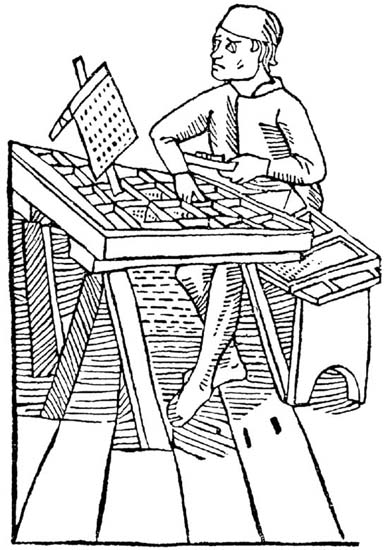
In a late fifteenth century woodcut, a typesetter chooses type to place in the forme.
The design was mostly dictated by the scribal traditions that had produced the graceful balance of two text columns and broad margins for decorations. The half-folio page (30.7 X 44.5 centimetres) was made up of two rectangles – the whole page and its text area – recalling the so-called ‘Golden Section’, which specifies a crucial relationship between short and long sides. The proportions are complicated to work out, and produce an irrational number, as π is, but it is a ratio of about 5:8.* They are proportions which, as the Greeks knew when they built the Parthenon, are peculiarly easy on the eye, and were therefore common in both architecture and art. In typesetting, these proportions work well, because if the line is too long the eye has difficulty in finding the start of the next one, unless spacing between the lines is disproportionately large; and if the lines are much shorter they look abrupt. Since the text and page are not exact ‘Golden Sections’, Gutenberg may just have been following tradition.
Moreover, scribal tradition dictated that the text be off-centre, leaving broad margins along the top and left that were half those on the right and bottom, though both were in strict proportion to the whole. Gutenberg would have changed all this at his peril.
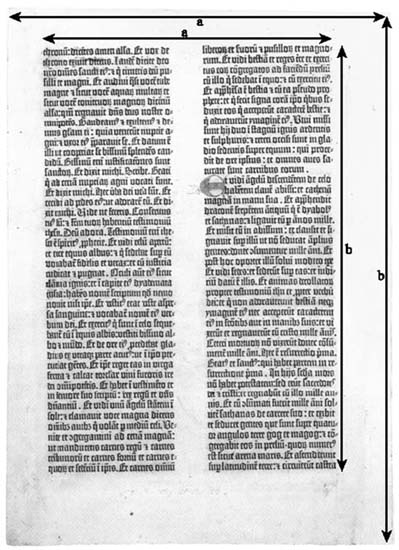
The two columns of Gutenberg’s Bible combine to approximate a ‘Golden Section’ area (see note opposite). Its page has almost the same proportions, and so do the type areas of many books (e.g. this one).
One element in the design seems to have been Gutenberg’s invention: a justified right-hand margin. Scribes couldn’t do this. When writing, you cannot, when beginning a line, know exactly where it will end – hence all the abbreviations and multiple letters as scribes struggled to fit texts into their Procrustean spaces, and the slightly ragged look down the right margins as they inevitably failed. Typesetting offered a chance to realise this scribal ideal by going back over set type and adding slivers of lead between words to space the line out, and thus provide an extra element of geometrical purity. But that introduces another problem. If you force the words apart to fill out the line, you risk creating ‘unnatural’ spaces between the words. The designer’s task is to strike a pleasing balance between column width, type size and white space between words and lines.
Listen to one of the modern masters of typography, Eric Gill, as well known for his eccentric sexual practices as his impeccable artistic taste:
Even spacing is a great assistance to easy reading: hence its pleasantness, for the eye is not vexed by the roughness, jerkiness, restlessness and spottiness which uneven spacing entails . . . It may be laid down that even spacing is in itself desirable, that uneven length of lines is not in itself desirable, that both apparently even spacing and equal length of lines may be obtained when the measure allows of over 15 words to the line, but that the best length for reading is not more than 12 words.
Now Gutenberg’s lines average around five to seven words. Why, if Gill is so impeccable, does Gutenberg opt for short lines? Because Bibles were meant not for fast, silent reading, but for careful out-loud reading. He therefore risks the faults of a narrow column, objectionable, as Gill says, because the ‘words and phrases are too cut up’. Yet Gutenberg’s setting is beautifully even, without being crammed. He achieved this by using all those little scribal tricks of compression, which we have dropped, and then avoided the somewhat sterile look of modern typesetting with a little stroke of genius: he did not count hyphens and punctuation marks as characters, so these overhang at the right, providing a pleasing element of relaxation, relieving the austere clarity of general design with a charming variety of detail. It’s a look that linotype machines and word processors cannot or do not do automatically. In so many respects, Gutenberg is the master still.
This little detail deserves a closer look, because it reveals the degree to which Gutenberg was obsessed with quality, an obsession which in this case seems to press at the fringes of sanity. For it is technically impossible to have a piece of type hanging off the edge, as the hyphen (and occasional full-stop) seems to. There is no space for it. The type was all contained within the forme – had to be, or it would all fall apart. So in order to be able to have a free-floating element on the end of a line, every non-hyphenated line had to be indented by the width of the hyphen, even if that particular column had no hyphen. The column width of the main text is actually a hyphen’s-worth less than the forme’s width. This was a practice that quickly fell out of favour, as typesetters treated all characters equally within the body of the text. What could have he been thinking of, to impose on his team, and his budget, a device of such subtlety? Who would ever have noticed? Precious few, unless they were told; which suggests to me a possible explanation. Gutenberg yearned for perfection, not only because this was the culmination of his life’s work, but also because only perfection beyond the reach of any mortal scribe would persuade a prince or archbishop to buy. I think that hyphen was a salesman’s bullet-point, the telling detail visible only to the discerning eye, proving to their majesties and eminences that, although the Bible looked like the best scribal work, it was actually something of an even higher order – super-scribal, superhuman, and therefore with a touch of the divine. What ruler, when granted this insight into the new technology, could fail to be impressed into buying?
Next he had to work out how the pages should be arranged. Because sheets of paper are folded, cut and inserted inside each other, pages are not printed in strict sequence. There was a complex pattern to be worked out: five double-spread leaves, each with four out-of-sequence pages, would be gathered into ‘quinternions’ – sections of twenty pages.
A crucial decision in typesetting involves the balance between the text and the white space between lines. There are several practical considerations here. The bigger the type and the wider the spacing, the more paper is required. Conversely, smaller type and denser packing makes legibility harder – all very well for student Donatuses, but not for Bibles that were to grace cathedral lecterns. Page size, type size and spacing were all specified by Gutenberg’s scribal copy. But no one had ever printed a Bible before, or dealt in so much vellum and paper, or costed such an operation, or knew what to charge, or how many to print, or what the returns might be. Gutenberg faced the paradox that has dominated much of publishing ever since: quality sells, but quality costs. How do you balance the two amid so many unknowns?
Well, he got it wrong. He opted for forty lines per column and started printing. His team had already printed the first nine folios (pp. 1–9 and 257–63) – some 180 copies of them – when Gutenberg stopped the presses and recalculated. Using the same setting, but minutely reducing the spacing, he could squeeze more lines on a page and save space. But maybe it would look wrong. He tried it: page ten has forty-one lines. It looked fine. You don’t notice the difference unless you count. So he took a final step and ordered forty-two lines per page, shaving five per cent off his vellum and paper costs. As a result, this glorious creation is known as the 42-Line Bible, or B42 for short, even though it isn’t all the way through.
That, at least, is a possible summary of a process about which nothing is known and everything has to be deduced. Experts have picked over every point, and still they argue, each seeking a share of the Gutenberg Grail – absolute certainty of what was achieved when, and where, and how.
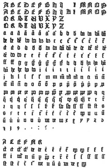
The type of Gutenberg’s 42-Line Bible
The search continues. In December 2000, the American scholar Paul Needham, librarian of the Scheide Library at Princeton, cast doubt on the whole theory of punch-made types bound into formes. Scheide is a philanthropist whose grandfather made a fortune from oil and built a collection of early books and manuscripts, among them the only Gutenberg Bible in private hands and a papal bull of 1456, printed by Gutenberg for Pope Callixtus III calling for a crusade against the Turks. Needham wished to produce a facsimile version of the bull, and together with his predecessor at the Scheide Library, Janet Ing Freeman, set about analysing every letter – each pseudo-scribal variation, each ligature, each contraction – in order to establish exactly how many Gutenberg used. This was a challenge, because, when examined in microscopic detail, minute variations show up, caused (or so one might assume) by the way the ink spread randomly on the slightly absorbent paper or by damage to the type. To iron out this typographic ‘noise’, Needham sought the help of a young computer whizz, Blaise Agüera y Arcas, who created software to do the job. He found something quite astonishing – that after excluding all the random elements there were not just a few varieties of each letter but dozens. The is, for example, had no fewer than ninety-four different bow-shaped dots over them and thirty-five different verticals. Could this be an illusion caused by variations in the ink, or paper, or the pressure of printing? Apparently not, because all the shapes appear between two and eight times. The variability must lie in the pieces of type. Equivalent irregularities occur in other examples of the D-K type, for instance, the hyphens in a 36-line Bible printed in Bamberg in 1461. This suggests an astonishing hypothesis: that the type was not produced from punches – at least not in the way everyone believes – for why would Gutenberg make thousands of punches in order to create variations that are invisible to the naked eye? One possibility, suggests Agüera y Arcas in a paper published in 2003 (see Bibliography), is that each individual stroke of each letter was formed with a very simple punch. Typefounders have occasionally produced ligatured letters by combining two punches, e.g. by making an ![]() with an A- and an E- punch, instead of making a new punch. Perhaps a similar technique was used on the thirty-five is and their ninety-four dots. And perhaps Gutenberg was working not with type cast from a common matrix, but from many temporary matrices, made from lead, sand, clay, plaster or even papier mâché. Agüera y Arcas concludes: ‘A consistent picture emerges if we hypothesize the use of temporary matrices, in combination with "elemental punches" which would have allowed the typemaker to form these matrices from multiple overlapping strokes.’
with an A- and an E- punch, instead of making a new punch. Perhaps a similar technique was used on the thirty-five is and their ninety-four dots. And perhaps Gutenberg was working not with type cast from a common matrix, but from many temporary matrices, made from lead, sand, clay, plaster or even papier mâché. Agüera y Arcas concludes: ‘A consistent picture emerges if we hypothesize the use of temporary matrices, in combination with "elemental punches" which would have allowed the typemaker to form these matrices from multiple overlapping strokes.’
Well, perhaps. For the moment we must live with a paradox: the traditional view that Gutenberg ‘must have’ used punches and formes and matrices and hand-moulds, because that is the only possible answer, against the new and apparently hard evidence that he could not have done any such thing – a conclusion supported by Japanese researchers, who have digitally superimposed letters from the Bible to reveal similar microscopic variations. We await a resolution.
To print this mammoth two-volume book, with its 3 million characters, was an immense undertaking. Imagine six compositors and twelve printers, two to a press, positioning the typeset metal pages, laying on the ink with their fat, soft, powder-puffshaped leather ink-balls, positioning the paper or vellum, sliding the carriage into position, winding down the press, feeling for just the right amount of pressure. Documents mention the names of several team members in passing – Numeister, Spiess, Krantz, Drach and eight others – but without specifying who did what, and in which of the two workshops. In any event, there would have been some economy of scale and labour, with the routine stuff pouring out of the Gutenberghof and the Bible being carefully assembled in the Humbrechthof. The experts and their assistants must have made a team of twenty-plus, maybe thirty, some staying in the town, some in the two houses, all needing meals, all engaged in a fury of creativity, and all held together by the aesthetic genius, the vision, the organisational skill and the technical mastery of the man who started it all.
![]()
The Bible, though, was only the greatest of the projects in hand, the number of which now increased under the inspiration of an event that stunned Christendom. In May 1453 the inhabitants of Constantinople discovered that God, Madonna, thick walls and a harbour chain were little use against at least 80,000 Turkish attackers – some claimed there were 300,000 – and an 8.5-metre bronze cannon, a monstrous bombard that would have done sterling work on the Western Front. Hauled by sixty oxen on a special wagon, it lobbed half-tonne stone balls at the city’s double set of walls once every hour or two from over a kilometre away. After two weeks the Turks found a little door left open by retreating Greeks. The city fell on 29 May. Its great cathedral, St Sophia, became a mosque, and Mehmet, the new emperor of the second Rome, turned it into the capital of an Islamic empire which now reached to Bulgaria and threatened Christian Europe as nothing had since the Mongols ravaged Poland and Hungary two centuries before.
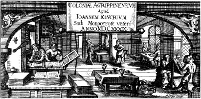
A seventeenth century printer’s workshop: typesetting (right), inking formes (left), printing (back centre) and proof-reading (back right).
Gutenberg was not one to waste such a chance. He rushed into print with a calendar that was also a ‘warning to Christendom against the Turk’, with month-by-month exhortations in doggerel to Europe’s leaders to unite, starting with the Pope (January). September calls to arms ‘Germania, du edel dutsche nacion’ (‘Germania, you noble German nation’), and the calendar ends with the first printed New Year’s greeting, wishing readers ‘Eyn gut selig nuwe jar’ (‘A good holy new year’) – namely 1455.
Meanwhile, indulgences galore flowed from his presses – presses, plural, for the headings of the fifty surviving indulgences come in two typefaces, both with several variants. What we have are the products of two different punch-cutters and two workshops, both churning out indulgences by the thousand for sale across the Frankfurt-Mainz-Cologne area. One is the D-K type, used for the Donatus, produced at the Gutenberghof. And the other uses the typeface that was also used in the first edition of the Bible, proof that Gutenberg’s projects, and all their related activities, overlapped each other.
![]()
With up to six compositors supplying three presses, working flat out, but allowing for religious festivals, Gutenberg and his team could have produced the 42-Line Bible – 180 copies, 230,000-plus pages, every page demanding its own separate impression – in about two years, two furious years of work in which they were also working on the other jobs. By the autumn of 1454, it was ready.
The evidence (pointed out for the first time in 1982) is a letter written by the future Pope Pius II, Enea Silvio de Piccolomini, a man who is worth a detour.
Humanist, libertine, scholar, novelist and traveller, Piccolomini was an Italian counterpart of Nicholas of Cusa, of whom he was almost an exact contemporary and good friend. He was the eldest of eighteen children of a Sienese landowner, who liked to trace his ancestry back to Romulus, and so named his eldest Aeneas, the legendary author of Rome’s greatness. Aeneas – Enea, as he was in Italian – started lower than Nicholas, had a wilder early career, but, being Italian, which always helped in the Church, rose higher. His local priest taught him to write, which got him off the family estate and into Siena as a student, and then a secretarial appointment to a local bishop. At the Council of Basel he was secretary to several different prelates; he toured England and Scotland as a secret agent; and became secretary to the anti-Pope, Felix V – not a good career move, because Felix was the last of the anti-Popes. Piccolomini’s fortunes began to turn in 1442, when the German king, Frederick III, headhunted him away from Felix, bringing him on to the side of the Roman Pope.
Along the way, Piccolomini had dabbled in literature, writing a novel in Latin based on a love affair of his court mentor, the imperial chancellor Kaspar Schlick. The History of Two Lovers is one of the earliest of proper novels, much longer than the short stories of Boccaccio’s Decameron. It is also the earliest ‘epistolary’ novel, the form perfected by Richardson in Pamela and Laclos in Les Liaisons Dangereuses 300 years later. Apart from its lit. crit. significance, it actually worked. Funny, romantic, sexy and smart, it was a bestseller for two centuries in all major European languages. The last translation into English was in 1929, so it’s not well known nowadays, but publishers please note: it would still work today if someone retranslated it properly. Piccolomini would not approve, because after he became Pope he disavowed it, without breaking the habit of writing. He became the only Pope, ever, to write his autobiography.
No sooner were copies of Two Lovers circulating than Piccolomini saw which way the wind was blowing and took holy orders. He was thus in a position to help Nicholas of Cusa engineer the 1447 deal by which the German princes turned against councils and backed Pope Eugenius, the one who made Nicholas of Cusa a cardinal. Eugenius rewarded him by making him bishop of Trieste, and his successor, Nicholas V, upgraded him as bishop of Siena. In 1454 he was given the task of winning over German princes to the idea of fighting the Turks, which he undertook in Frankfurt in October of that year. These were tumultuous times. Piccolomini was persuading an imperial diet to promise 10,000 troops for a Turkish crusade, while, outside, salesmen hawked Gutenberg’s indulgences to pay for them.
It was while he was in Frankfurt that Piccolomini saw something astonishing: beautifully printed Bibles on sale, in sections. Word spread fast, and his Spanish superior, Cardinal Juan de Carvajal – the one who had been in Mainz as a papal legate with Nicholas of Cusa in 1448 – wrote from Rome asking for details. In his reply, written the following March from Vienna, where he was based with the emperor’s court, Piccolomini noted the urgency of Carvajal’s request, sent by a ‘courier faster than Pegasus. But enough of this joking’:
Of that extraordinary man [viro illo mirabile] seen in Frankfurt, nothing false has been written to me. I did not see complete Bibles, but quinternions [those five-sheet, twenty-page sections] of different books, written in extremely elegant and correct letters, without error, which Your Eminence could read with no difficulty and without glasses [berillo].
His information was that 158 copies had been printed, perhaps as many as 180. The uncertainty over the length of run is understandable, since it was increased during production to keep up with demand. By the time of writing, some copies had reached Vienna. He went on to say he would try to buy a complete Bible for Carvajal, but doubted that he could, ‘both on account of the length of the journey and because, before the volumes are finished, they say that buyers are ready’.
It would be nice if Piccolomini’s ‘extraordinary man’ was actually Gutenberg, even nicer if they met. From the infuriatingly elusive first sentence, it seems Piccolomini had previous information about the man that he checked personally, but not face to face. All we know is that someone was pre-selling Bibles, unbound, hot off the press. More likely it was Fust, taking his business interests in hand, sending off assistants to likely buyers with their printed folios, while Gutenberg oversaw production back in Mainz.
When I started this book, I wanted to share Piccolomini’s sense of wonder. I, too, wanted to touch a Gutenberg Bible. The British Library has a couple, one of paper, the other velum. I live close by, I visit frequently. But I never even made the request, because I assumed they must be held in conditions of sacrosanct purity. To touch those precious, and (I assumed) fragile pages? That was surely for a scholarly priesthood, and I was not an initiate.
In fact, when I asked, I was surprised. To beat rival scribes, Gutenberg made his bibles robust enough to last for centuries. John Goldfinch, at the BL, was happy to show me one. The library’s depths are as secure and sterile as a marble tomb, and I expected a sacred relic handled with gloves and masks. But when John brought the first of the library’s two-volume paper copy into the examination room, he just, well, carried it in, put it on the table and let me turn the pages.
True, I was one of a select group. But, as John said, that was because very few scholars nowadays actually need to feel the object itself. The digital version is so superb that it satisfies almost all researchers. But nothing can replace the object itself: the minute, hand-painted flow of plants and birds on a few first pages – St Jerome’s prologue, Genesis, Proverbs (see inside covers) – the brilliant dots of gold-leaf, the dense, thick pages, the red strike-through rubrications, and the sooty black ink of the Textura letters. I felt their roughness. In places, the type had raised a faint image on the reverse side of the page. A blind person could learn to read these words.
‘Talk about degrees of separation,’ I said at last. ‘Gutenberg touched these pages. I must be picking up a few of his molecules.’
John laughed. ‘Well, perhaps. But this copy belonged to George III. It was probably taken apart and washed before it was bound.’ Washed? ‘Yes, there were marginal notes – you can see one here – they wanted to get rid of, perhaps places where readings started and ended.’
What an astonishing fusion of technology and art. And how equally astonishing that this gorgeous object should have sprung from Germany rather than Renaissance Italy. As Albert Kapr says (in Douglas Martin’s superb translation): ‘It still appears miraculous that this first typographic book in Europe . . . should be of such sublime beauty and mastery that later generations up to our own day have rarely matched and never excelled in quality. For regularity of setting, uniform silky blackness of impression, harmony of layout, and many other respects, it is magisterial in a way to which we can rarely aspire under modern conditions. Behind such an achievement can only have stood a personality inspired by a passionate commitment to excellence, and able to communicate this drive and enthusiasm to his fellow workers.’
![]()
Back in Mainz, Gutenberg’s business had become horribly confused.
To review:
By early 1452 Gutenberg has borrowed 800 gulden to set up a printing works, in which his team is working on Donatuses, the Sibylline Prophecies and possibly indulgences, all aiming to ease cash flow while he prepares for the project that will repay all: the missal. Then, suddenly, no missal. Now the big project is going to be the Bible. But his first workshop is working flat out. Can’t stop. Has to expand. He puts the problem to Fust, gets more money to set up a second workshop, supposedly for the Bible alone. But that workshop too needs cash flow, and as soon as it is ready he shifts some of the minor jobs there, in particular (as the typeface reveals) some of the lucrative indulgences. Meanwhile, none of the income goes to fulfil his contract with Fust. If an auditor stepped back in time, wouldn’t he find something a little out of control here? Even if he started to repay Fust, he would have a problem identifying which profits are rightly Fust’s, and which are Gutenberg’s.
Here’s what our hypothetical auditor might have discovered (for details, see Appendix I):
|
The Bottom Line |
||
|
gulden |
||
|
Costs (inc. debts): |
4,500 |
|
|
Income received: |
4,000 |
|
|
Income projected: |
5,000 |
|
|
Profit in 1455: |
zero or minus |
|
|
Projected profit, minimum: |
4,500 |
|
Our auditor might well have concluded that in early 1455 there was some light at the end of Gutenberg’s tunnel. Assuming the Bible sold, Fust and Gutenberg stood to cover all their costs and make over 2,000 gulden each – enough to buy twenty substantial houses. All they needed to do was hold steady.
![]()
Yet in the midst of this creative ferment, sometime around the middle of 1455, with the 42-Line Bible off the press, pre-sold, with the money about to roll in, and fame and fortune about to be secured for all, Fust pulled the plug.
It is a grim and sad story. Fust sued for his money, a total of 2,026 gulden. Gutenberg could not pay: of course he couldn’t, as Fust would have known, because all the money was tied up in the works and in its products, in particular its chief treasure, all of which was, so Fust claimed, mortgaged to him. There were hearings. Witnesses were called. A preliminary judgement was made. And in November the notary, Ulrich Helmasperger, wrote the record of the final hearing, held to receive Fust’s oath that his evidence in the previous hearings was true. Or perhaps not, if Gutenberg had any new arguments with which to contend the claim.
The Helmasperger Notarial Instrument, as this cornerstone of Gutenberg research is grandly named, is a single sheet of vellum the size of a large coffee-table book, in a glass case in the library of the University of Göttingen. Actually, Helmasperger did not write it himself. It is a word-for-word copy of his original notes in the local dialect, nicely designed into a box of spidery text, and complete with a rather amateurish decorated initial for the opening words: ‘In gottes namen, amen . . .’ (‘In God’s name, amen . . .’).
Helmasperger records a vivid little scene. Not precisely a courtroom drama, because this was not a trial, but a hearing held in the refectory of the Convent of the Barefoot Friars, a Franciscan mendicant order. The church and the cloisters, standing near today’s theatre just off the cathedral square, were torn down in the eighteenth century.
It’s Thursday, 6 November, just before noon. There are friars in the hall, probably preparing a midday meal. Helmasperger is there, quills and paper at the ready, flanked by half a dozen witnesses. One of those in attendance is Gutenberg’s assistant, Peter Schöffer, Fust’s adopted son, who may already sense the flow of events, may already be preparing to jump ship; more about him later. Fust arrives, as scheduled, with his younger brother, Jakob.
No sign of Gutenberg.
Jakob asks in a whisper whether the accused is going to show up. At this moment, three men enter: the former minister of St Christopher’s (the church just beside the Gutenberghof ), and Heinrich Keffer and Bechtolff von Hanau, Gutenberg’s house-servant and his lad, respectively.
What are they doing here? asks Fust. They reply they have been sent by Gutenberg to witness what’s said. So no new evidence or arguments are to be offered, apparently. Helmasperger must have raised an eyebrow – what now? – for Fust’s impatient answer is caught by the dutiful notary:
Thereupon Johann Fust declared and asserted that he wanted to abide by the day according to which he had made his arrangements, and that since he had been waiting until twelve, and was still waiting, for his adversary Johann Gutenberg, who had not deigned to place himself at their disposal, he declared himself ready and well prepared to comply with the verdict on the first article of his demand.
Then someone read out his claim, going over the old ground, leading up to a restatement of his demand for 2,026 gulden. In the previous proceedings, now summarised, Gutenberg had prevaricated. He admitted the first 800 gulden, admitted the interest, but argued that it was for his equipment, and did not have to be repaid. On the second loan of 800 gulden he was quite happy to explain where the money went, and said it was totally unfair of Fust to claim anything, because it was for das werck der bucher – the work of the books. No mention of what books, mind. It’s fair to assume lots of different ones, plus all the related stuff – presses, punches, typefounding, paper – that went along with book production, because the phrase would be somewhat cavalier, not to say sacrilegious, if it was intended to describe the Bible alone. It was in Gutenberg’s interest to emphasise that this was a joint venture, for mutual benefit. This being so, he hoped he wouldn’t have to pay up.
Nothing new, then. Helmasperger concludes that Gutenberg had better do his accounts and repay anything that was not put to their joint use. And if Fust can prove he really had borrowed the money from elsewhere, and had to pay interest on it, then Gutenberg would have to make that good as well.
Fust lodged his statement, swore it was true, his fingers on the holy relics in Helmasperger’s hand, so help him God and the saints. End of hearing.
![]()
Fust does not come out of this well. History, favouring our hero, tends to see Fust as the cynical businessman foreclosing just at the moment when he can be sure of seizing all the assets from his brilliant partner, just before the debt would have been repaid. It is easy to see this as the nasty and vindictive act of, not to mince matters – and many haven’t – a complete and utter money-grabbing BASTARD.
But Gutenberg seems remarkably compliant, odd in a man who had shown himself to be no stranger to ruthlessness (remember him throwing Niklaus von Wörrstadt into jail in Strasbourg and his court action to recover a debt in Frankfurt?). His demeanour suggests a more moderate view. Gutenberg was enough of a businessman to know that he had been steering very close to the wind these last six years (and longer actually: there was the eighty-dinar loan from Strasbourg to be serviced, as well as the 150 gulden from his cousin Arnold). Now he had made the mistake of muddling other projects in with the Bible. In effect, Fust was accusing Gutenberg of sharp practice, if not embezzlement, and Gutenberg knew he had a point.
This is how Fust and his friends may have seen things:
As we know, the investment Fust had made was about to pay off, most spectacularly in the form of the Bible. But that’s with hindsight: when he took action, and even at the time of the case, Fust had no guarantee that he would ever see any returns. His cash was gone, and so was the income. He was in a hole, and it was getting bigger. Out of patience with his overworked colleague, he had to ensure and control the cash flow. These two were not close friends. They were business partners. Fust did what he thought was necessary, and Gutenberg, to give him his due, did not plead for time. He knew the rules, knew he had no legal defence, knew he had no one to blame but himself.
What is missing is the actual outcome. We have to infer it. In a sense, the amount Gutenberg had to pay is irrelevant, because he couldn’t pay any of it. Technically, it seems, all the hardware was mortgaged to Fust. He wanted his cash back and his profits properly controlled. His redress was obvious: he would take over the second works, with its presses and its product – the Bible – and handle the business himself from now on.
Was this vindictive? Well, certainly neither generous nor imaginative, but not vindictive. More hard-nosed, I’d say. This was, after all, business, and business did not include being vindictive. He might have driven a harder bargain, tried to seize the lot. But they seem to have done a deal. Gutenberg could keep the Gutenberghof, with its single press and its jobbing contracts (and perhaps the type of the 42-Line Bible, the fate of which is still a mystery). And, out of the goodness of his heart, Fust would presumably, after repaying himself, make sure that Gutenberg got his share of the profits from the Bible. In the end, as bastards go, Fust was less than a complete and utter one.
That was how, at the moment of success, Gutenberg lost control of his own creation, and how Fust became Mainz’s second – and now predominant – printer.
*The ratio is as follows: if you replace ‘short’ and ‘long’ by a and b, then a:b is the same as b:a+b. The ratio is 0.618 . . . ad inf., commonly rounded to 0.625, or five-eighths. Therefore, if the shorter side is 5 and the longer 8, the second element (b:a+b) becomes 8:13. The ratio was widely believed to have magical properties: hence the significance of the pentagram, which contains 200 ‘golden sections’.