
PART TWO
3
What Is Counted Ends Up Counting
As Michael Lewis chronicled in his hit book Moneyball, general manager Billy Beane made the perennially underfunded Oakland Athletics competitive against teams with deeper pockets. How? By being one of the first Major League Baseball managers to run statistical analysis on the troves of data collected about player performance. He appeared to perform a near-miracle by using the data to strengthen the Athletics’ talent recruiting methods and in-game decisions. When Lewis’s book hit the market, it spawned a public debate among baseball enthusiasts about whether analytics or more traditional means of scouting and recruitment, which relied on people finding and then offering star athletes enormously high salaries, could help identify the best talent. Data have largely won. During the two decades that followed, most baseball teams hired full-time analysts. In the 2020 season, the Tampa Bay Rays were widely considered the most adroit users of analytics. They reached the 2020 World Series with a payroll of just $28.2 million, the third lowest of the thirty teams in Major League Baseball.
The success of data analytics in transforming how teams form and perform is one example of how powerful data can be if we have the digital mindset to use that data wisely and—as you will see—how misleading or frustrating data can be if we do not understand how they really work.
Nick Dalton is a self-proclaimed “nerdy math guy who likes sports” who read Moneyball and wondered if he could attempt to apply Beane’s methods to improve the performance of the men’s high school basketball team he coached. Dalton floated the idea by a couple of his friends, one of whom pointed him to an article that Lewis had written for the New York Times Magazine about basketball analytics.1 The article profiled Shane Battier, a 6-foot-8-inch guard for the Houston Rockets and former first-round draft pick out of Duke. He was a solid player. But he never excelled on any of the traditional basketball metrics, such as games played, field goals made, free throw attempts, rebounds, or assists. His talent could not be easily measured. As Lewis wrote, “His greatness is not marked in the box scores or at slam-dunk contests, but on the court Shane Battier makes his team better, often much better, and his opponents worse, often much worse.”
“That piece was like a revelation to me,” said Dalton. “One of the things that stuck with me the most was how Battier was good at forcing players to shoot in their ‘zones of lowest efficiency.’ I just thought if I could figure that out—like what our opponents’ ‘zones of lowest efficiency’ were—and share those data with my players, maybe they could start directing them to those spots and forcing a shot and we’d get an edge. You know, find the ‘moneyball’ for high school basketball.” Dalton, who also taught math at the high school, thought he had an ace up his sleeve because one of the star players on his team had read Lewis’s article and also happened to be a star student in Dalton’s AP Calculus class. “I thought it was going to be a slam dunk—pun not intended—because I happened to have some kids that were strong in math on the team that could actually take some of the stats and make use of them.
“Boy, was I wrong.”
After tracking down that year’s box scores for most of the high school teams in the division and running some simple stats to compute things like whether players missed more field goals in the second half of the game than the first and from which zones on the court players were most likely to miss shots, Dalton started to coach his team on how to read the statistics. “It was a disaster,” he said. “They were so good at math in the classroom, but they couldn’t handle the applied nature of the stats. I would ask them what action they thought we should take based on the stats, but they just couldn’t translate it. So, I tried just walking through the data with them. Some of them seemed like they got it and were interested, and others just dismissed it because they were convinced that their intuition was better. I couldn’t convince them that the numbers were accurate.” In other words, just because Dalton’s students were strong at math didn’t mean they had developed a digital mindset capable of making productive use of data.
After some failed attempts, Dalton did finally convince some of his players to try to use the analytics in their playing strategy. “That was maybe the worst disaster of all. We’d do just what the stats suggested we do and the guy would make the shot anyway. I’d explain to the kids that it was just probabilities, but probabilities are hard to grasp—even if you’re good at more abstract math like calculus.” Again, without a digital mindset it can be difficult to fully integrate the concept that a statistically probable win doesn’t mean that changed behavior will result in the right outcome every time.2 More importantly, as Dalton realized, “I’m not even sure that the data that I got from the division was that accurate to begin with. So, I might have spent all that time doing the analytics and coaching the kids to use it, and the data on which I made those predictions was just wrong to begin with.” After trying to “moneyball” his high school basketball team for three years, Dalton gave up. “I just do fundamental skills coaching and play calling now,” he remarked. “I think it’s best to leave the analytics to the pros.”
The power of analytics is replete with stories about successful teams like the Oakland Athletics, successful players like Shane Battier, or giants like Amazon or Facebook. They have been able to win more games, improve their on-court performance, and increase product and ad sales exponentially by mining data patterns and using them to make predictions about people’s behavior. In fact, you can hardly walk into a sports franchise front office or a corporate boardroom without hearing someone saying something like, “The real moneyball would be …” or “We need to find the moneyball for …” Even if you’re not a sports fan or an analytics expert, you may have seen the movie starring Brad Pitt and Jonah Hill and sensed that most major league sports and countless industries are changing how they operate as the result of advanced analytics.
But you’re not likely to have heard many stories like Nick Dalton’s—stories in which well-intentioned individuals try to use analytics to their advantage and fail. Yet in our experience, failures like Nick Dalton’s are more common than successes like that of the Tampa Bay Rays. To be clear, that’s not because the promises of analytics are overhyped. It’s because seeing the world through an analytics frame is difficult for people who aren’t trained in data science, who aren’t used to probabilistic reasoning, or who don’t have the money to hire people who can do the job for them.
Developing a digital mindset means you have to become comfortable with analytics and to learn from Dalton that just saying “I’m going to use analytics” isn’t enough. Even deploying them isn’t enough. At the very least, you need to know what questions to ask of the data and what to look for when you or someone else analyzes them. It also helps if you can anticipate potential consequences of analytics, including errors, and the effects different modes of data representation can have on others. We will devote chapter 4 to the key statistical analysis that you will need to understand; here we will cover how to avoid pitfalls like Dalton’s by becoming proficient in basic issues inherent in working with data. By demystifying the nature of data, you will be able to see what it can and cannot do.
In our work with global tech giants in software like Microsoft, in finance like Discover, in defense contracting like FLIR, and in mining like South32, as well as in interviews with hundreds of employees facing the challenge of making sense of data produced, collected, and computed, we’ve identified three key practices that help people to develop a digital mindset that allows them to see, think, and act analytically. They are:
· Learn where the data came from
· Open the black box of data categorization and analysis
· Match your data visualizations with your audience’s needs
Learn Where the Data Came From and How They Got There
One of the most important things to know about data is that they are not natural substances. They don’t exist in the wild. Data are created. They serve as representations of some thing or some process. This means that they are, at the most basic level, inherently subjective.
Think of it this way: At some point, someone thought that a natural phenomenon like wind could be depicted in a variety of ways—how cold it is, how fast it blows, how dry it is. To depict wind in these ways, devices were invented to measure those qualities, and those measurements were recorded and stored. Such measurements—what we call data today—represent wind in a number of ways. But they are not wind. Nor do these data objectively describe what wind is or how it feels. They’re simply ways to explain wind.
It’s somewhat of a misnomer to say that data are collected. It is much more accurate to say that data are produced.3 In fact, keeping in mind that data are not simply to be collected like shells, but rather are always the product of technological capture and social categorization helps us to keep a critical focus on the role that data play in our decisions—it’s a contrivance, an agreed upon conceit that doesn’t exist independent of us. Wind exists independently of our measurements, but not the other way around. We could, conceivably, decide we want to measure wind with a new category—say, “strong enough to blow off a hat,” and produce the corresponding data.
Understanding this concept means that you are less likely to blindly trust in data’s truth or facticity. We tend to find data credible, or factitious, especially if we don’t entirely understand what they represent. Keep in mind that just because it’s data doesn’t mean it’s necessarily accurate or true.
From paper ledgers to barcodes—flexibility vs. accuracy
The oldest form of data production is manual input, which means data production started when people began to write things down. For example, scraps of ancient Greek musical notation are forms of data production, as are ancient religious scrolls. For data production in the more recent past, think of a bookkeeper for a domestic goods store in the 1800s logging sales and inventory entries into a ledger. The bookkeeper would likely record price and quantity of the items bought and sold, date of purchase, and other useful information. Perhaps they produced data about what the weather was like when the delivery was made or who the delivery person was.
In early bookkeeping, the bookkeeper exercised broad discretion about what he or she recorded; therefore those manual entries would vary widely from one bookkeeper to the next. One may tally and record goods sold over an entire month, while another bookkeeper may do the same for each day of the week. There was no standard.4
Today, most merchants don’t produce such data manually. Items come with barcodes that are scanned and data about the item are automatically populated into a software program that describes the item in terms set and favored by the vendor (such as color, weight, and dimensions) and with data points designed in by the software provider (such as the time the scan was made, and so forth). Many companies are moving or have already moved to even more automated processes in which radio frequency identification (RFID) tags automatically trigger data entry into software programs upon arrival in a warehouse, without the need even for a manual scan by a person.5 But still, it’s just data being produced.
A digital mindset means that you comprehend the risks that undergird the automated processes we use today to produce data. Regarding inventory and sales, the use of more advanced technologies makes the data production process more accurate: it’s much less likely that the scanner or RFID tag will record the wrong data about an item than a person would. However, it also removes the degrees of freedom that individuals have to determine what data they want to produce. The scanners and RFID tags in use in many high-end retailers and distributors come preprogrammed with data fields, as does the software that records the figures produced by the scans. Unless the hardware or software was designed to be configurable by the user, producing the data you want requires negotiating with various vendors.
Becoming analytically nimble means that even with this lack of flexibility, you will find opportunities to produce new data sources from pre-populated fields for your own use. For example, if the software used to track incoming merchandise records a delivery date and a sales date, it’s relatively easy to calculate how long the merchandise sat as inventory before it was sold, thus creating a new data point that can be useful for understanding specific facets of the business.
Garbage in, garbage out
Automated data are not free from error or consequence. Computer scientists and data analysts use the phrase (attributed to IBM programmer and instructor George Fuechsel) “garbage in, garbage out.” Flawed, useless, or nonsense data produce flawed, useless, or nonsense output: garbage. Having a digital mindset means keeping an eye on the “data in” to make sure they’re not garbage.
What’s more, in highly automated data production, the consequences of putting garbage in can quickly spiral out of control. For example, in the fall of 2004, an employee logged on to a computer system run and maintained by appraisal officials in Porter County, Indiana, to check on the value of a property in rural Valparaiso. The data were used by a standard algorithm to automatically adjust property appraisals based on values entered by county officials. The property was a twelve-hundred-square-foot, two-bedroom house. No one’s quite sure how it happened—the user probably hit the wrong key—but the assessed value of the house was changed from $120,000 to $400 million.6
That was the simple garbage in. The garbage out was more complex and consequential than you might imagine. It started with a property tax bill for $8 million received by the homeowner a year later. The homeowner flagged it and got it corrected to the proper amount, a more modest $1,500. Still, before the error was discovered, the assessor’s office ran a standard calculation using the data on assessed home values to calculate property tax revenues for the county. This calculation would be used in annual budgeting. The county budget, in turn, was used by eighteen taxing districts in their own budget-planning processes. By the time the data entry error was discovered and corrected, those eighteen taxing districts had already begun to spend their annual budgets. But the budgets they were spending were much higher than was real, because that one house value made it appear they would be collecting much more in property tax than they would.
Officials were forced to return to the county an advance of more than $3 million on funds that were never collected! As a result, the city of Valparaiso had to cancel important infrastructure restoration efforts to complete street resurfacing and sidewalk repairs.
When you recognize that all data are produced by machines and continually touched and reconfigured by people as they go about working with it, you can’t help but begin to see that the way we collect our data and how we provide access matters tremendously. Nick Dalton discovered this principle when he realized that the high school basketball player stats from the box scores he collected were not always accurate, making his analytic models useless.
A first step in building analytical insight is to recognize that when we are presented with data, we need to ask how those data were produced, who had access to them, and how well they represent the behavior or activities we hope to understand.
Data are increasingly produced through sensors—think of how your Fitbit or Apple Watch produces data about the number of steps you take or your heart rate, or how heavy mining equipment now comes with an array of sensors that can document how many hours a drill has been in operation or how thin the rubber is on a tractor’s tires. Professional sporting leagues are investing heavily in sensors and cameras to collect granular behavioral data on players.7 The National Basketball Association (NBA) implemented a system with multiple cameras in all of its arenas that can capture granular data on players’ movements. These photo- and sensor-based technologies are allowing the NBA to do much more than collect data on free throw attempts and rebounds; they can now track whether players make a break by leading with their right or their left foot and how much their speed has increased or diminished throughout a game. Think of what players like Shane Battier could do with such refined data.
Data are also being produced about us continually as we engage in actions online. As we will discuss in chapter 6 on experimentation, our behaviors and activities online leave a digital exhaust that companies like Google, Amazon, and many others use as data about our viewing patterns and purchasing decisions. Although the behavior and activity collection methods are certainly more sophisticated than manual bookkeeping, the data produced today are still prone to the same kinds of errors and misinterpretations that bookkeepers of long ago faced. And they’re as vulnerable or more vulnerable to accidents like the one in Indiana, as well as hackers.
Despite data’s wondrous potential and power, a digital mindset also respects its fallibility. Learning where the data came from and how they got there means recognizing not only that that data can be flawed or inaccurate, but that we tend to perceive data to have what’s called “high facticity.” Numbers, especially long strings of numbers automatically generated, can feel true and objective even if they are not. We are all prone to accepting data-driven conclusions, especially if we do not understand the nuances and details of how data work. Better is to develop a digital mindset that recognizes data’s limitations and fallibilities.
Open the Black Box of Data Categorization and Analysis
Facility with analytics such that you develop a digital mindset means understanding that data alone don’t do much beyond providing description. Description is useful for understanding patterns and trends, like which employees are most productive or when demand for certain products is at its highest.
Data have even more use and power when they move from description to prediction, and then to prescription. The Oakland Athletics used data to predict talent contribution and to prescribe on-field strategies to beat other teams. A school system might use data about its city’s real estate sales to predict future student demographics and prescribe students’ educational needs. But unlike description, in which the way that data are aggregated into patterns and trends is relatively straightforward and easy to understand, prediction and prescription require data classification, manipulation, and computation that often goes unseen. To most people, the data analytics process is a black box. Data go in one side and out the other side come descriptions and predictions.8 Building an analytical mindset requires making the black box of analytics as transparent as possible, so you’re able to have confidence in the predictions.
In our conversations with people who regularly produce or consume the predictions and prescriptions of the analytics process, we’ve learned that seeing into the black box means understanding both how data are categorized and how the algorithms that sort data into causal models are constructed.
One of the under-recognized facts of data analytics is that data don’t exist apart from the systems we use to classify them. When you think about data as a human invention, created through conceptualization, measurement, storage, and public negotiation, it’s easy to see that data carry some political ramifications. One of our favorite examples, as reported by professors Geoffrey Bowker and Susan Leigh Star in their book, Sorting Things Out: Classification and Its Consequences, is the publicly reported data that show that Japan has one of the world’s lowest rates of fatal heart attacks.9 Many people point to this statistic to suggest that low levels of fat in the Japanese diet help to reduce heart disease. However, a number of epidemiologists suggest that an alternative reason for such a low rate of fatal heart attacks is that in Japan many heart attacks are actually classified as strokes. As Bowker and Star note, heart disease “is a very low status cause of death within Japanese culture, suggesting as it does a life of physical labor and a physical breakdown. Accordingly, what Americans would call heart attacks often get described as strokes, since an overworked brain is more acceptable there.” If we reclassify some or all of Japan’s stroke data as fatal heart attacks, the country’s low rate is no longer a viable statistic—and the Japanese diet may not be as crucial in reducing heart attacks as we’d like to believe. Developing a digital mindset means thinking hard about how the data you use are classified. Basic data literacy means learning how to ask the right questions to ascertain details about what exactly is going on inside that black box.
Count what is being counted
Albert Einstein once said that “not everything that can be counted counts, and not everything that counts can be counted.” When it comes to classification, we might add to this adage that what does get counted ends up counting and, of course, what we don’t count often doesn’t end up counting. Whether things count or not has consequences. Basketball analysts agree that players like Shane Battier that excel in areas not captured (and thus not valued) in traditional categorization schemes lose significant money during salary negotiations throughout their careers because they can’t point to data showing areas in which they contribute to the game. Even though someone like Shane Battier might be, as Michael Lewis called him, a “No Stats All-Star,” in the conventional data categorization regimes in which basketball operates, he couldn’t take that title to the bank. Conversely, some players may land big contracts based on what’s in box scores that more modern analysis suggests isn’t that important. In other words, what gets counted may count more than it should.
Again, this brings us back to facticity. Because data can easily and often feel innately objective to us is all the more reason to develop a digital mindset that helps us see inside the black box to question its objectivity. As these examples reveal, even though we might do our best to be accurate in how we measure and collect data points about behavior, the way we classify the data we collect is always a socially informed decision and therefore subjective rather than objective. Today, we largely leave the classification process up to the companies that create the software that tracks the data we input. But those classification schemes are neither natural nor neutral. In fact, they are often the source of much conflict and consternation for data scientists. A contemporary case in point is Netflix’s Napoleon Dynamite problem.
Understand categorization schemes
Netflix is well known for its advanced use of data analytics. Because Netflix can’t sustain monthly subscription pricing if a customer only watches one or two movies or shows a month, they have to get customers to realize that many appealing options exist on the streaming service. Netflix’s success in doing so is largely attributable to its early machine learning recommendation engine called CineMatch. CineMatch analyzed customers’ viewing habits and recommended other content that the customer might enjoy. If you viewed a dystopian action movie, Netflix would recommend other dystopian movies, other action movies, and other dystopian action movies. If you viewed an animated release from Pixar, Netflix would recommend other animated movies—and so on.
At the core of CineMatch’s analytic architecture was an algorithm that classified movies into various categories (action, dystopian, animation, Pixar, and more) representing a film’s attributes. This categorization scheme was then submitted to machine learning algorithms that performed a technique called “singular value decomposition.” The technique worked by comparing the categories that two movies had in common and correlating those categories to ratings given by users in order to make a prediction that a viewer will like the recommended movie because he or she liked a similarly categorized movie in the past. The analytics were quite robust. Singular value decomposition had a much higher likelihood of predicting what movies a person would decide to watch than simpler techniques like “collaborative filtering,” which basically recommended movies to you liked by other people who’ve liked some of the same movies as you.
But singular value decomposition had flaws and weaknesses. In 2007 Netflix launched a competition, promising to award $1 million to the person or team who could improve its categorization scheme enough to make CineMatch’s predictions 10 percent more accurate. Len Bertoni, a computer scientist who lived outside Pittsburgh, solved part of the problem by figuring that if he could predict whether you’d like the movie Napoleon Dynamite as accurately as he could for other movies, he would get closer to winning the prize. Napoleon Dynamite was a 2004 cult hit that people tend to either love or hate. Its 2 million Netflix reviews are polarized between many five-star scores and many one-star scores, with far fewer scores in between.10 It is a quirky film and doesn’t hew to many traditional categorizations, thereby making it difficult for CineMatch to produce recommendations for viewers who liked it. Bertoni wanted to figure out an algorithm for Napoleon Dynamite that could correctly categorize all these factors.
The CineMatch improvement contest concluded in 2009, and Netflix now uses a group of newer, more advanced algorithms, but the categorization problem still haunts the company as well as many others who use data to derive predictions and descriptions that will affect people’s behaviors. As confusing as the process is, the lesson for developing a digital mindset is rather clear: Seeing inside the black box of analytics requires understanding how things are categorized, why they are categorized that way, and when categorization simply won’t work. Once you understand the categorization schemes that are being used to build predictive and prescriptive models, the next step to seeing inside the black box of the analytic process is to have a sense of what kind of statistics are being used to establish correlational and causal relations between categories and activities. We’ll discuss how you develop this competence in chapter 4.
Beware of bias
A corollary to the garbage rule is “bias in, bias out.” Looking inside the black box is also essential for making sure that the predictions and prescriptions you’re making are not inherently biased. The most well-intentioned engineer can build a model for an algorithm intended to serve society as a whole but end up reinforcing structural inequalities that are embedded in the data sets used to build the model. For example, the city of Boston used a well-designed app called Street Bump to solve the city’s persistent pothole problem. The app records accelerometer data from smartphones as a resident drives, producing data that suggested the car just hit a pothole. However, since the residents with smartphones tended to be of higher income, it only was identifying potholes in more affluent neighborhoods. When Boston’s Office of New Urban Mechanics discovered the data bias problem, the approach was immediately adapted to represent the city as a whole—not just its wealthy.11
In another example, MIT Media Lab researcher Joy Buolamwini and Timnit Gebru, who was a doctoral student at Stanford University at the time, published a study called “Gender Shades” that revealed the inherent gender and racial biases within facial recognition software built on data predominately representing white males.12 IBM’s system, for instance, was more than 34 percent worse at determining gender for dark-skinned women than light-skinned men. The findings shattered IBM’s claims of the system’s accuracy, along with similar claims from Microsoft and others (see figure 3-1).
Sarah Brayne, a professor of sociology at the University of Texas at Austin, spent nearly a decade tracing how the Los Angeles Police Department (LAPD) used advanced data algorithms to identify “hot spots” where crime typically occurred or predict where crime was likely to occur and also to identify “chronic offenders” and target them for surveillance.13
Operation LASER, or Los Angeles Strategic Extraction and Restoration, maintains an ongoing list of community residents to monitor by creating “Chronic Offender Bulletins” for so-called persons of interest.14 Each of the sixteen LAPD divisions using the program is required to maintain at least a dozen bulletins, intended to help officers identify the most active violent chronic offenders in a given geographical area. It’s easy to believe in what looks and sounds like an accurate and reasonable strategy.
FIGURE 3-1
Gender bias in facial recognition software

Source: Data from J. Buolamwini and T. Gebru, “Gender Shades: Intersectional Accuracy Disparities in Commercial Gender Classification,” in Conference on Fairness, Accountability and Transparency, PMLR (January 2018): 77–91.
However, that identification process has two stages. In the initial screening phase, a crime intelligence analyst subjectively decides whether the police records, like arrest reports and field interview cards, associated with an individual are “relevant” enough to move them to a “workup” phase. This is where human bias begins to influence the so-called objectivity of data; clearly, not all crime analysts will reach the same subjective conclusion about which individuals are or are not relevant enough to include. The second stage, the workup, involves software provided by a data analytics company called Palantir that pulls data from multiple sources on identified people’s criminal history and affiliations, their social media networks, and other sources. It uses that data to create a “chronic offender score” for the individual. As Brayne observes, when the data analytics algorithm directs officers to specific areas, such as a low-income area where crime is predicted to be higher, the algorithm collects more data points than it does in more affluent areas, thus biasing the model in favor of directing them back to low-income areas in the future.
Here’s where the data can create a circular reasoning process. Police presence in low-income neighborhoods results in more data points, which then puts them in contact with more low-income individuals, which creates more police records, which then have a higher likelihood of accumulating into the chronic offender score. The problem was exacerbated by economics. Austerity measures also encouraged police to find ways to be more efficient with their resources, which led to the LASER program being selectively employed across the city. To save money, LAPD never used LASER in the most affluent areas of LA, which have the lowest crime. This means that residents in those neighborhoods were less likely to have interactions with police, less likely to show up on the LAPD’s watchlists, and less likely to have a chronic offender score than people in low-income neighborhoods. The vicious cycle persists.
Brayne’s findings starkly illustrate how subjective data analysis can be because of its reliance on human bias. Yet the complexity and multi-step process of the analysis can make bias difficult to detect. Developing a digital mindset, as Brayne did, means having the patience to tease out the details of who is doing what part of the analysis and how bias and its unintended consequences can lead us to faulty conclusions.
Machine learning analysis can perpetuate human bias. The department also uses a data analytics service called PredPol, which relies on a machine learning algorithm much like the ones used by Facebook and Amazon for advertising purposes. It’s a mathematical model that inputs three variables: where a crime was committed, when it was committed, and what type of crime it was. The model is used to calculate hot spots in a 150-square-meter area where, theoretically, certain types of crimes are more likely to be committed on a given day and which patrol officers use to plan out their daily routes.
These biases in the collection and analysis of data have major consequences for prediction that demonstrate how technologies like PredPol can reinforce racially biased policing patterns and practices. To test this bias, researchers William Isaac and Kristian Lum used a publicly available version of PredPol’s algorithm of reported crime data from Oakland in 2010 to predict where crimes would occur in 2011.15 Then they compared their prediction map to what actually went on in Oakland. If the data weren’t biased, the maps would be similar. But in fact, the test using PredPol directed police to Black neighborhoods like West Oakland instead of zeroing in on where drug crime had actually occurred.
The researchers also compared PredPol’s map to a map of where Oakland police arrested people for drug crimes. They found that the maps were very similar. Regardless of where crime was happening, predominantly Black neighborhoods had about two hundred times more drug arrests than other Oakland neighborhoods. In other words, police in Oakland are already doing what PredPol’s map suggested—over-policing Black neighborhoods—rather than zeroing in on where drug crime is happening. “If you were to look at the data and where they’re finding drug crime, it’s not the same thing as where the drug crime actually is,” Lum said in an interview. “Drug crime is everywhere, but police only find it where they’re looking.”
As you can see, the social and political ramifications of bias in reading and using data can be enormous. Would police practice change if they were made to review the difference between PredPol’s analytic model and the maps created to show where drug use actually occurred? Perhaps, but it would require a developed digital mindset that could understand both the human bias that plays into data production and the consequences of relying on data produced from that bias.16
Match Your Data Visualizations with Your Audience’s Needs
Every urban area in the United States with a population of more than fifty thousand is required to establish a Metropolitan Planning Organization (MPO), which produces comprehensive regional plans that municipal governments approve. While these plans are not legally binding, they serve as a guide for regional governance that concerns transportation and land use development.
We spent over two years working with two MPOs in different regions of the United States, which we’ll call Oceanside and Mountainside. Both were embarking upon a new data-intensive process using simulation models to make predictions that would inform their regional plans. Both regions adopted a new algorithmically based simulation technology called UrbanSim.
UrbanSim was developed by UC Berkeley professor Paul Waddell and his colleagues to make predictions about the effects of policy choices, and to do so through analytic models that were as transparent as possible, thereby avoiding concerns commonly voiced in urban planning that “black-box” models were so complex that their logic could not be explained to policy makers or the public.17 The comparison of these two regions illustrates another point someone with a digital mindset understands: Data don’t speak for themselves. How you present the results of your analytics matters immensely in whether people believe them or not and whether they’re willing to trust them or use them to make decisions.
Oceanside planners brought UrbanSim to the center of their discussions with community groups by showing the technology’s 3-D visualizations. With the click of a few buttons, planners could show a simulation of areas detailed enough to show specific buildings. It could show how regions changed over time. The visualization put viewers in the heart of the action. It was common in meetings for community members to blurt out comments such as “I know that street” or “That’s my neighborhood” as they watched the animation play. As one community member noted after seeing the model in action: “Those changes are amazing. You can just see them happening. I feel like I’m right there. I can’t wait for those improvements. The city is going to be so much better.” The richness of the visuals of the UrbanSim animations immersed viewers in them. (See figure 3-2.) And for many spectators the model stopped appearing as though it represented a possible future that could happen (if the right policy changes were made and the assumptions embedded in the model were accurate) and started appearing as though it were the future that would come to pass. Although in this case people were responding to visual rather than numerical representations of data, again it demonstrates our tendency to believe in data’s facticity; if the data seem convincing they must be true.
FIGURE 3-2
Oceanside approach: Still shot from 3-D animation of model produced by UrbanSim

Source: Courtesy of UrbanSim, https://urbansim.com.
The level of detail combined with the sensory 3-D experience immersed viewers in the projection and evoked embodied, emotional responses. If the projection looked less dense than they feared (“not at all like Manhattan”) they were soothed, but if the high-rises they disliked appeared, they reacted with negative emotions. Planners repeatedly brought up the challenge of managing emotional outbursts at public meetings. The simulation of high-rise buildings, what one anti-density activist called “stack-and-pack housing,” elicited a strong, embodied response from stakeholders. Furious people from diverse backgrounds filled public comment periods to complain about anticipated school crowding, traffic jams, and depleted water resources.
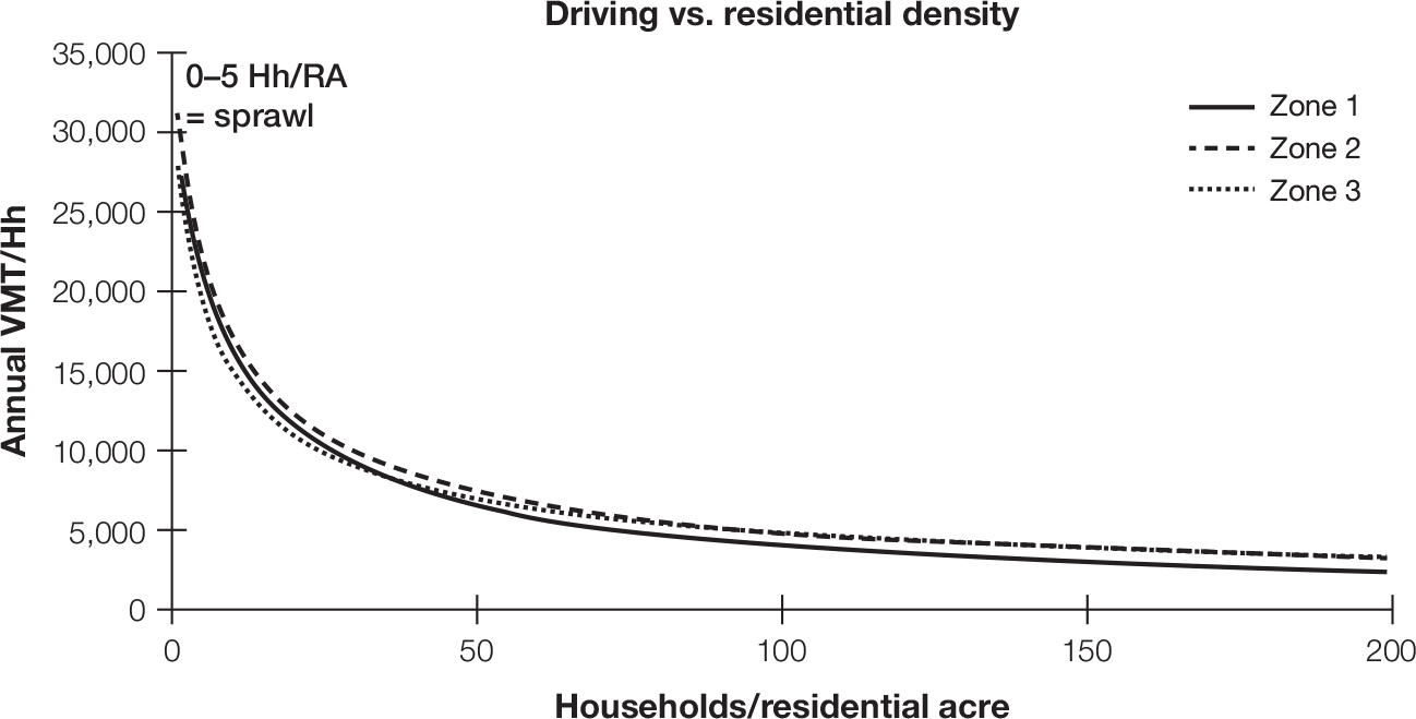
FIGURE 3-3
Mountainside approach: Graph derived from data from UrbanSim model
Source: UrbanSim, https://urbansim.com.
Mountainside chose not to produce 3-D animations for their meetings. Their stakeholders saw only charts, graphs, and tables, such as the graph presented in figure 3-3. A transportation modeler described his work to us as “mostly charts and graphs. I like charts and graphs, but 90 to 95 percent of my work can be monotonous, just looking at spreadsheets a lot, managing stuff, cleaning stuff up.”
Mountainside planners had very good “people skills,” but their charts and graphs lacked the richness, intrigue, and logical sequencing of 3-D visualizations. As one stakeholder from a tribal community group noted, “The planners do their best, but you kind of lose your attention. It’s just boring looking at all those numbers.” Planners understood this sentiment well. As Alison, a Mountainside planner, commented, charts and graphs were inherently limiting because they lacked a sense of intuitiveness that other visuals could provide. In addition, making charts and graphs of specific issues of concern (such as the relationship between housing density and driving distance illustrated in figure 3-2) artificially isolated what were actually many interdependent issues. Viewers of charts and graphs had to try themselves to integrate multiple data points and often had difficulty doing so. As one community member noted, “When you see so many different graphs you don’t really know how they all go together and I don’t really feel like I see what’s going to happen.” Unlike in Oceanside, people here didn’t see the future of their community through UrbanSim.
You might read this description and conclude that Oceanside’s 3-D representation of algorithmic models was more successful than Mountainside’s because it resulted in higher levels of stakeholder participation. Yet our finding shows the opposite. At Oceanside, stakeholders were highly engaged but about issues that planners did not feel were productive. The high levels of granularity and immersion offered by the models focused people’s attention on very specific issues as opposed to big-picture issues that needed public comment and reflection. At Mountainside, where, by contrast, models were not granular or immersive, stakeholders found it difficult to comment on and react to specific outcomes in the model, so they moved their discussions to a higher level of abstraction and asked big-picture questions about the overall plan and its objectives.
Research on what psychologists call construal levels points to why such a paradox existed and why it endured.18 When individuals are psychologically distant from something, they construe that object at a higher, more abstract level than they do if they are psychologically closer to it. This dynamic is also true if an event is hypothetical. One study by Cheryl Wakslak, a professor at the University of Southern California, and her colleagues found that when people were asked to think about an upcoming camping trip, they grouped the objects they would pack for the trip into much more specific and concrete categories if they were told the trip was very likely to happen than if they were told the camping trip was unlikely.19 Oceanside residents felt a closer psychological distance to what might happen. Indeed they experienced a future they literally could see and were more likely to believe it would happen. They found themselves lost in the details of their response in a forum that was meant to guide a higher, big-picture discussion. In contrast, Mountainside residents were free to imagine important issues such as density in any way they chose. They weren’t reacting to a single, visible future. So they felt a more distant psychological distance to hypothetical changes, making those predictions seem less likely, and could therefore engage in more abstract discussions.
What this means, and this is key for developing a digital mindset, is that presenting more or more detailed data isn’t always better. It may create the wrong discussions and distract from the important analysis.20 This is especially crucial as technology makes it easier and easier to collect and present enormous quantities of data in visceral detail, as the Oceanside planners did.
More specifically, professor Batia Wiesenfeld, a management scholar at New York University, and her colleagues have speculated that it may be easier to move from more abstract mental representation, as Mountainside urban planners did, to the more concrete representations that Oceanside planners presented than the other way around.21 This means you may need to figure out ways to encourage participation when your data model representations are less immersive at first so as to help people operate at abstract levels and then shift, over time, to representations that are more immersive and that activate concrete response and discussion.
You’ve taken an important step in developing your digital mindset by thinking about data, a topic that might at first seem basic and unimportant. Data are just numbers and stuff we store in computer files, right? No. Data are an artifice. Something we produce. And once you think of it that way you see its power and pitfalls much more clearly. You’re able to think critically about data and not fall prey to their facticity, or the sense that it must be true because it’s numbers.
You’re ready for the next step, thinking about the math behind data—thinking about statistics.
GETTING TO 30 PERCENT
Constructing Facts
Data and their use permeate nearly every facet of life. Understanding the basic principles of data analysis is key to developing a digital mindset:
· Data are produced and are the product of what we choose to capture and agree to categorize.
· Errors in what data we input can have unintended consequences; the tiniest of errors can sometimes create enormous failures.
· Data classification is a socially informed decision. Because discrepancies in classification can lead to misnomers or erroneous decisions, you need to think hard about how a data set is classified.
· Classification schemes that use complex algorithms to predict behavior, such as Netflix’s singular value decomposition, are highly influential but not entirely accurate; here is where data scientists focus much of their attention.
· Developing a digital mindset that can critically analyze the data means becoming aware of how bias, existing in both humans and the machines who learn from the data we give them, can skew our notion of what is true and accurate. Data confirm rather than compensate for racial or other bias.
· Data don’t speak for themselves. Tell the story of your findings so their meaning is clear and relevant.
· Technology provides us with sophisticated options for data sharing, so you want to think about how much or how little data you provide people in any given situation, and in what format. We have emotional responses to how data are represented. Learn to match your data representation with your specific audience.
Developing all these facets of a digital mindset helps you to work with data’s inherent subjectivity and avoid the common pitfall of believing in what can feel like data’s inherent and objective facticity.