3
Over the course of 1966, U.S. involvement in Vietnam deepened. Four hundred thousand U.S. troops were deployed in the country; monthly spending on the war ballooned to $2 billion—it had been $105 million in 1965—and American military engineers and private U.S construction firms created an extensive infrastructure in the country: roads, bridges, barracks, ports, and airfields. Despite these actions, the Vietcong increased its strength.1 A major reason for this was Operation Rolling Thunder’s ineffectiveness. Rolling Thunder was intended to crack the morale of Hanoi’s leaders, compel them to call off the Southern insurgency, and weaken the communist fighting capacity by impeding the flow of men and supplies to the South along the Ho Chi Minh trail. However, Rolling Thunder achieved none of these goals. There were few substantial targets in North Vietnam that could be attacked. The North Vietnamese government was decentralized. The population was expertly dug in, especially in the cities.2 Moreover, North Vietnam was an agrarian nation with much of its military matériel dispersed in the countryside or moving down the Ho Chi Minh trail. Additionally, although American aircraft bombed the trail daily, it was extremely well hidden and protected. The Vietcong buried their installations deep underground so that they could not be seen from the air. Further, one of the strongest air defense concentrations in the world protected the trail: eight thousand antiaircraft guns, more than two hundred surface-to-air missiles, a complex radar system, and computerized control centers, all of which were supplied by the USSR.3 What was coming down the trail was also minimal. In contrast to the needs of the South Vietnamese and American forces, the Vietcong had no airplanes or tanks, and they did without most of the daily “necessities” American soldiers enjoyed in the field, such as plentiful fuel, spare parts and shells, not to mention beer, shaving cream, and talcum powder. In fact, the North Vietnamese and Vietcong needed no more than a total of fifteen tons of supplies a day from the North in order to sustain their effort in the South. Rolling Thunder also complicated negotiations. Pham Van Dong, the North Vietnamese prime minister, insisted that discussions could not be held until the bombing ended.4 Finally, the communists’ success against Rolling Thunder encouraged them to pursue a protracted conflict with the United States. They saw that they could bog the U.S. forces down in an unwinnable situation that would make them question their objectives.
During 1966, antiwar protests similar to those undertaken in 1965 continued. At the same time, dissidents in the American government began to become aware of the problems of the deepening conflict and used a congressional investigation to publicly highlight their concerns. Arkansas senator William Fulbright carried out this investigation in February 1966. What became known as the Fulbright Hearings were particularly significant in the course of the war. They illustrated for the first time to the American public—in nationally televised proceedings—that respectable, high-profile people were unsympathetic to the Johnson administration’s waging of the war. Among these respectable men were Fulbright, Wayne Morse (one of two senators who opposed the Gulf of Tonkin Resolution), and the foreign policy expert and Cold War theorist George F. Kennan. Although Kennan’s ideas regarding international diplomacy inspired the Truman Doctrine, he believed they were not applicable to the situation in Vietnam. The hearings also confirmed for many in the older generation that their sons and daughters’ protests were genuine.5
In contrast to 1965, during which almost all artistic engagement took the form of extra-artistic actions, in 1966 antiwar engagement stemmed predominantly from artists’ efforts to incorporate antiwar sentiment into works of art. The major arena for these efforts was again Los Angeles, and in particular APC’s organization and creation of the Artists’ Tower of Protest, known most often as the Peace Tower (figs. 4 and 5). In order to fully contextualize the Peace Tower as well as other efforts artists would make to combine art and politics in their work from 1966 onward, one must understand how such efforts would have been undesirable and unwelcome in the American fine art system of the 1960s, which was dominated by the formalist ideas of Clement Greenberg and the pop and minimalist movements (which were both in part informed by Greenberg’s ideas).
4. Charles Brittin, PHOTOGRAPH OF THE ARTISTS’ PROTEST COMMITTEE ARTISTS’ TOWER OF PROTEST, Los Angeles, 1966. Silver dye bleach print, chromogenic process. Charles Brittin Archive, Getty Research Institute. Used with permission.
5. Charles Brittin, Photograph of the Artists’ Protest Committee Artists’ Tower of Protest, Los Angeles, 1966. Charles Brittin Archive, Getty Research Institute. Used with permission.
Greenberg, arguably the most influential American art critic of the second half of the twentieth century, explained his conception of formalism most famously in his 1960 essay “Modernist Painting.” He argued that the “rationale” of modernist painting—like all the modernist arts (and in this thinking he was inspired by the writings of Immanuel Kant)—was to employ its own methods to criticize itself. Such criticism was done not, Greenberg explained, “in order [for the medium to] subvert [itself], but to entrench it more firmly in its area of competence.”6 For painting, according to Greenberg, this meant two things. First was a purification of painting of the effects of any other artistic mediums, but sculpture, theater, and literature primarily. Accordingly, for Greenberg, painting could not be three-dimensional, which was the domain of sculpture; it could not be representational, which was the domain of literature; and it could not generate dramatic effects outside its material, which was the domain of theater.
The second aspect of painting’s critique of itself was a stress on the limitations that constitute the medium of painting. These limitations consisted of three things: the rectangular shape of the supports, the properties of pigment, and the flat surface of the support. The flatness of the support was the most important limitation modernism could critique, according to Greenberg, for flatness was unique to the medium of painting. (The “enclosing” shape of the supports, in contrast, was shared with theater, and color was shared with sculpture and theater, Greenberg explained.) In this way, according to Greenberg, historically “realistic, illusionist art had dissembled the medium, using art to conceal art. Modernism [starting with Manet] used art to call attention to art.”7
Consequently Greenberg considered political art irrelevant to and irreconcilable with avant-garde practice, and thus a kind of retrograde art that was aesthetically inferior.8 In a 1969 interview, during an intense period of debate about the war and artists’ rights, he declared that the role of the artist was to make good art, and social awareness had not “worked” to make good art in the last hundred years or so. For him, art “solve[d] nothing, either for the artist himself or for those who receive his art.”9 If given the chance, Greenberg probably would have also echoed Arshile Gorky’s sentiments about political work, that it was “poor art for poor people.”10
Though Greenberg was the most influential advocate of formalism, as the 1960s progressed he was not its only champion. There was a climate of taste and opinion that aligned itself with Greenberg’s approach to art criticism and art history, not least because formalism offered an attractive, sophisticated, aesthetic, intellectual approach that had not previously existed in American art-writing.11 Within this milieu were two influential younger critics, Michael Fried and Rosalind Krauss, who were particularly important to the extension of Greenberg’s influence. (For this reason, Hilton Kramer, among others, has called Krauss and Fried—and Barbara Rose, although “less so”—the “School of Greenberg.”)12 During the late 1960s Krauss and Fried were primarily writing forArtforum, which had become a major arbiter of taste in the American art world, and whose editor in chief, Philip Leider, gave both of them—but especially Fried—principal placement in the magazine. (As testament to Leider’s confidence in Fried, Leider devoted an entire 1969 issue to Fried’s doctoral dissertation on Manet’s sources.)13
Greenberg’s influence did not truly start to fade until the early 1970s, when his acolytes began to rebel against formalism and his longtime opponents were increasingly able to have their opinions heard. Greenberg’s theories were principally criticized for being too dogmatic (especially in an environment where post-structuralist theory was making major inroads); unrelated to artists’ work; and generally inconsistent. A common grievance was his vague definition of “quality,” which was a concept central to his evaluation of artworks. Others felt that political and social issues of the time unavoidably affected art, and consequently, that formalism was no longer tenable.14 Still others broke with him in the late 1960s after his controversial decision to let paint weather off some of the sculptures of David Smith (of whose estate Greenberg was made a trustee in 1965). Since Greenberg had unsuccessfully tried to persuade Smith to leave his work unpainted during his lifetime, this move was condemned as crowning evidence of Greenberg’s often-noted arrogance and his feeling of superiority over the artists and art about which he wrote.15
Alongside formalist theory, the dominance of the (rarely conflated) pop and minimalist movements in the United States throughout much of the 1960s also discouraged the creation of politically engaged work. With few exceptions, artists associated with both movements created works that rejected metaphorical connections with anything outside their material attributes, such as the artist’s psyche, feelings, or emotions as well as current events. In this way, pop artists and minimalists—though their artworks were markedly different—emphasized the coolness, cleanliness, and factory-made, serial, anonymous qualities of their works, and their works’ complete lack of material attributes like gestures and particular relational arrangements, which had been central to abstract expressionism, the dominant postwar American avant-garde movement. Though pop artists obviously included readily recognizable subject matter in their work, such as images from comic books and consumer products, they both proposed that these images were chosen for their meaninglessness and banality, and underscored their interchangeability. It is important to note that even though their thinking was influenced by Greenberg (who refused to embrace either movement), pop and minimalist artists were also encouraged in their approach by a variety of artists, writers, and philosophers who either proposed an object-focused approach to art-making or promoted ideas that inspired such an approach, such as John Cage, Marcel Duchamp, Ad Reinhardt, Samuel Beckett, Ludwig Wittgenstein, George Kubler, Susan Sontag, and Alain Robbe-Grillet.16
Though Robert Morris and Donald Judd contributed significant writings on the subject of minimalist practice, Frank Stella and Andy Warhol were the two most influential exemplars of 1960s pop and minimalist sensibility. Carl Andre’s comments about Stella’s work in the catalog for Dorothy Miller’s Sixteen Americans exhibition in 1959 in many respects constituted the minimalist sensibility’s “opening statement.”17 Andre wrote, “Art is the exclusion of the unnecessary. Frank Stella has found it necessary to paint stripes. There is nothing else in his paintings. He is not interested in sensitivity or personality, either his own or those of his audience. He is interested in the necessities of painting. Symbols are counters passed among people. Frank Stella’s painting is not symbolic. His stripes are the paths of brush on canvas. These paths lead only into painting.”18 Later in the sixties, Stella expanded on Andre’s description. He explained, “I always get into arguments with people who want to retain the old values in painting—the humanistic values that they always find on the canvas. If you pin them down, they always end up asserting that there is something there besides the paint on the canvas. My painting is based on the fact that only what can be seen there is there. It really is an object.”19 Warhol, for his part, famously explained that he wanted to be a machine and that “if you want to know all about Andy Warhol . . . just look at the surface of my paintings and films and me, and there I am. There’s nothing behind it.”20
Despite pop and minimalism’s apolitical approach, it must be mentioned that over the course of the war a few such artists did attempt to reconcile their work with their sentiments about the war. Further, most (if not all) of the artists involved with both movements were antiwar and attended antiwar activities, or just considered their work subversive or their practices socially engaged enough to have some relevance to the antiwar effort.
One of the first examples of a minimalist politically engaged work was Dan Flavin’s monument 4 those who have been killed in ambush (to P.K. who reminded me about death) (fig. 6). Installed as part of the Jewish Museum’s landmark 1966 exhibition Primary Structures—the first major museum exhibition of what would become known as minimalism—Flavin’s sculpture consisted of his signature fluorescent lights—with red-colored gels covering the bulbs—set into a corner at about waist height. The bulbs were arranged in the shape of what could best be described as a crossbow. One of the lights, which could be seen as the arrow of the crossbow, was set parallel to the floor, jutting out into the gallery space directly toward the viewer. It rested on other perpendicular lights that appeared to be the bow.21 Taking Flavin at his word (i.e., the title), the work served as a memorial for soldiers who were victims of ambushes. According to Alex Potts, this reading coincides with Flavin’s personal attention to the “concrete politics” of the mid-1960s, when ambushes were becoming a “big concern” for soldiers.22 Flavin’s hinting of the work to be a memorial also places it in the company of various future antiwar works (by artists such as Ed Kienholz and Robert Morris, after his surprising political awakening in 1970), which used the motif of memorials-before-the-fact (i.e., advance memorials) as a way to protest the war before its end. These memorials both established the undeclared war in Vietnam as an actual war—one that necessitated a memorial—as well as foregrounded the increasing numbers of American dead.
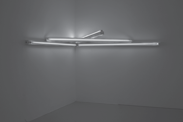
6. Dan Flavin, monument 4 those who have been killed in ambush (to P.K. who reminded me about death), 1966. Red fluorescent light. 8 ft. (244 cm) wide, 6 ft. (183 cm) deep. CL no. 108. Photograph by Cathy Carver. © 2012 Stephen Flavin/Artists Rights Society (ARS), New York. Courtesy of David Zwirner, New York.
One should be hesitant though to allow the title (and Flavin’s words) to entirely govern the understanding of this work, primarily because it obfuscates the work’s aggression. Again, Flavin’s bulbs are configured into the shape of a crossbow that seems to aim a blood-red arrow at the viewer’s chest. One wonders if the work was meant to echo the feeling of an ambush for the viewers, possibly encouraging them to identify with the victims.
Art historians, mostly in recent years, have also proposed subtle antiwar arguments for other minimalist objects and in turn the artists who created them. Minimalist works’ non-elitist materials, integrity, efficiency, and simplicity, for example, have been seen as an argument for a non-stratified society, objecting to a hierarchical world order in which war and conflict are common occurrences. Carl Andre’s late 1960s floor pieces are a case in point. Julia Bryan-Wilson, for example, has most recently read them as a subversive gesture, a “mute anti-utilitarianism” that “acts powerfully to redress the balance” in society.23 As well, she argues that the movement of such unaltered materials into an art context unchanged was Andre’s attempt to foreground a “zero-zero economic vector” and disrupt these materials’ movement in society from use-value to exchange-value.24 Further, for her, Andre’s floor works’ horizontal equivalences suggest a “utopian space” for human interaction.
Andre’s eventual involvement in the Art Workers’ Coalition, as well as the ideas of Herbert Marcuse’s “dimension of possible liberation,” buttress this opinion of Andre’s production. Aligning Marcuse and Andre is understandable, for during the 1960s, Marcuse’s ideas were brought to bear on Andre, Morris, and others through a set of art critics (foremost among them Gregory Battcock). In such texts as Counterrevolution and Revolt and Essay on Liberation, Marcuse called artists the primary agents of change in his idea of the “new economy.” He saw artists as able to create new forms that “could sustain a dialectical unity between what is and what can (and ought to) be”—though significantly, he gave no indication of what these art forms might look like.
Donald Judd’s political engagement has also been considered in recent scholarship. As opposed to the obdurate blankness of his minimalist production, David Raskin has argued that Judd’s anti-traditional, anti-subjective, symmetrical, serial art was generally “in keeping with the oppositional movements of the 1960s and its rhetoric” and was “designed to counter the concentration of power in the elite,” due to its aesthetic, which “rejected the pernicious social values institutionalized in Modernism.”25 Raskin also believes Judd’s “art contained a subtle call to action,” for, like Andre’s work, it foregrounded a rejection of hierarchy in society.26 Raskin uses one of Judd’s early, red, untitled works from 1962 to demonstrate this. He explains, “No aesthetic hierarchy is generated in the geometric opposition of near-right angles, the physical opposition of materials, or the visual opposition of colors. As the work defines both internal and external volumes and stresses its status as an object in the real world through its lack of a base, it allows no part to be more important than any other, nor than the structure as a whole.”27 At the same time, Raskin explains that Judd believed art was a weak instigator of social change, and that any art that advocated an agenda was at risk of becoming propaganda and thus failing as art. Like Andre, Judd was involved in pacifist political action outside his work during his life in New York.28 Most significantly, Judd opposed the construction of the Lower Manhattan Expressway and was involved with Citizens for Local Democracy (run by H. R. Shapiro) and their organ, a newspaper called Public Life. Citizens for Local Democracy was particularly interested in promoting a Jeffersonian township model of government, and Raskin has sourced a good deal of Judd’s political commentary in his writings of the period to Public Life. A reliance on Jeffersonian ideals was not unusual for the time. As the historian Barbara Tischler explains, political activists during the 1960s took the ideas of Locke and Jefferson quite seriously.29
Judd also actively opposed the war in Vietnam. Early on, he donated and contributed work to the Peace Tower and marched against the war. In the summer of 1969, during a residency at the Aspen Center for Contemporary Art, he and his wife, Julie Finch, published an antiwar announcement in the Aspen Times on behalf of the War Resisters League.30 Judd created one antiwar work of sorts as well, his “Yellow Poster,” for the 1970 Westbeth Peace Festival (which benefited the New York Peace Action Coalition and Student Mobilization Committee to End the War in Vietnam). The poster was made from four mimeographed 8.5 × 11 inch yellow pieces of paper printed together as one. The four pages together contained thirty-two quotations Judd culled from historical and contemporary sources that advocated pacifism by illustrating the horrors of excessive government power.31
Political interpretations of the major minimalists such as Flavin, Andre, and Judd did not go over well with more “outright” political artists during the Vietnam War. Leon Golub, for example, took such points of view to task. In a letter to Artforum in 1969, he explained that he saw no political engagement in minimalist production and considered minimalism as just another expansion of formalism, which, he said, maintained “the dream of the perfectibility of art” while supporting the technological masters of American empire that “export destruction [and] . . . burn and drive peasants from their homes.” Moreover, Golub argued against ideas that minimal shapes refer to the world. “Sure,” he said, “the ‘real’ world has bricks, gas stations, earth, and cubes . . . the ‘real’ world is also Americans in Asia or Guatemala.”32
Others also have argued that minimalism actually colluded with the aims of the U.S. government.33 For example, some Art Workers’ Coalition participants argued that Flavin collaborated with the enemy because in his works he used General Electric fluorescent bulbs and GE made munitions for the war.34 And James Meyer has proposed that minimalism’s 1968–1969 circulation through Europe in exhibitions such as The Art of the Real: USA, 1948–1968 and Minimal Art became a pretext for European contestation of U.S. military policy at the height of the war.35 It seems doubtful, however, that the specific aesthetics of minimalism should be credited with awakening Europe to U.S. foreign policy, as another art form may have been just as representative of American hegemony at this historical juncture.
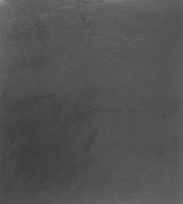
Apart from the more canonical minimalists, during the late 1960s there was one prominent antiwar exhibition of minimalist work, the Paula Cooper Gallery’s 1968 Benefit for the Student Mobilization Committee to End the War in Vietnam, which will be discussed at length later on, as well as the production of works by Phoebe Helman, Ellsworth Kelly, and Brice Marden that took the form of gray or black monochromatic paintings. These works have been viewed as signifying the melancholic mood induced by the war.36 The black paintings of Wally Hedrick (who was one of the first artists to engage with the American presence in Vietnam with his 1959–1963 Anger) were another example of this type of work (figs. 7 and 8).
Hedrick’s black paintings were entirely, deeply black, with surfaces ranging from scumbled to flat. They were unique among the painters of black canvases of the time, such as Ad Reinhardt, Frank Stella, and Robert Rauschenberg, in that the paintings were originally nonblack, figurative works, and Hedrick had tarred them over with heavy layers of black paint. Yet during the 1960s, Hedrick moved toward the production of “virgin” black works—which had no image to begin with underneath and were simply black paintings. To Hedrick, these more basic monochromes signified the withdrawal of his talent from Western culture, as well as the black of death and mourning, symbolizing the loss of lives and the loss of light (enlightened thinking) in the United States. In an exhibition of some of the paintings, Hedrick even comically and eerily compared damage to some of the early paintings in the series—the reason for which was probably just their means of storage and transportation—to the physical injuries of Vietnamese war victims. For example, he wrote in notes that were on display, “P.S. Those in the Aid Station, to the rear of the Gallery, are wounded, M.I.A.s and war orphans that received little or no medical help. Please open your heart and home to them.”37
7. Wally Hedrick, Vietnam, 1968. Oil on canvas. 73 × 66 in. Photo: M. Lee Fatheree. Estate of Wally Hedrick.
8. Wally Hedrick, War Room, 1967–1968/2002. Oil on canvas, 8 panels; 132 × 66 in. each. Courtesy the Estate of Wally Hedrick and The Box, Los Angeles. Photo by Fredrik Nilsen. Collection of Paul and Karen McCarthy.
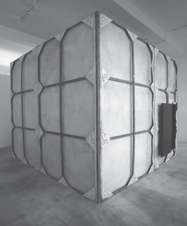
In 1970 Hedrick began work on an installation of black paintings, called the Black Room, which is alternatively called the War Room. Black Room was planned as an entire room (with ceiling, floor, walls, and door) made out of bolted-together black canvases. The whole work, for Hedrick, was at once his largest rejection of “irrelevant aestheticism” and an expression of how the United States had “boxed itself in” with the war in Vietnam. Hedrick said that he also wanted to create a place for people to confront their feelings about the war. Depending on your politics, the door would either shut you in or serve as an escape hatch. While the Room was never completed—it has no floor or ceiling because the war ended, and the war was, for Hedrick, the reason for its existence—the installation (comprising only walls that create a five-foot square space) was resurrected and exhibited with the onset of the Gulf and Iraq Wars.
As far as the antiwar character of pop art, while for the most part it was apolitical, at points during the war James Rosenquist and Roy Lichtenstein created works that engaged with the war or other related 1960s political issues, and the antiwar work of artists like Peter Saul, Martha Rosler, and Öyvind Fahlström had immediate relations to pop.38 Also, especially at moments and in situations where a connection with the war was desired by artists, art critics, or the viewing public, arguments were proposed that major pop works were in point of fact antiwar. For example, in 1968, upon its first major exhibition in New York at the Metropolitan Museum of Art, James Rosenquist’s F-111 was labeled antiwar, and this interpretation has adhered to the painting to the present day.39 The major reason behind this line of thinking was that in 1968 its primary subject—the F-111 airplane—had become a catastrophic failure for the U.S. military in Vietnam.40 The F-111 was incredibly costly to produce, structurally problematic, and impotent in the face of advanced Soviet missile defense and guerrilla war in Indochina. Rosenquist’s foregrounding of the plane was thus interpreted as criticism. Importantly, however, Rosenquist did not intend F-111 as a specific commentary on Vietnam. The painting was completed before the war became well-known, and when the F-111 was still in development. In this respect, as Michael Lobel has recently argued, if Rosenquist had wanted to comment on Vietnam in 1965, he could have easily picked a plane that was being used in the conflict, or better yet, a helicopter, which (as seen in Nancy Spero’s works and the writings of Michael Herr) was “already indelibly linked with the American military’s [Vietnam] operations.”41 The fact remains, however, that after F-111 was embraced as a Vietnam painting, Rosenquist did not come out and publicly reject the label.42
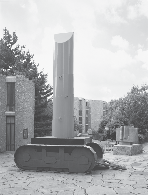
A similar situation occurred with Claes Oldenburg’s Lipstick (Ascending) on Caterpillar Tracks (fig. 9) in 1969, which was considered antiwar during the war, primarily by Barbara Rose, because of its juxtaposition of “a classic consumer product with militarism,” as well as its insinuation, akin to the work of Spero and Judith Bernstein, that “American military policy was an outgrowth of repressed sexual drives.”43 Rose went further to say when Lipstick failed to inflate—the lipstick portion was initially inflatable, and faulty—the implicit question becomes, “of course, how virile is America?”44 In recent scholarship, however, Tom Williams has questioned Rose’s point of view. Specifically, Williams believes the sculpture, even though it did suggest antiwar themes, was much more engaged with current Yale internal politics and university building plans, particularly for what would become the Yale Center for British Art. According to Williams, students sought, by planting the work in the center of—and thus “defiling”—the university’s “technocratic” but crucial Beinecke Plaza, to protest Yale’s indifference to the needs of students and the broader New Haven community, which were consistently an issue in the late 1960s.45
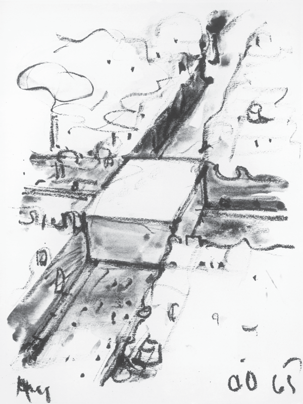
Lipstick was not Oldenburg’s only association with the antiwar movement. Though its reference to Vietnam was not specific upon its creation in 1965, Oldenburg’s imaginary advance memorial, the Proposed Monument for the Intersection of Canal Street and Broadway, New York: Bloc of Concrete Inscribed with the Names of War Heroes (fig. 10), was eventually sold at auction in September 1970 to benefit antiwar congressional candidates.46 Oldenburg’s block was a huge cube that would be the same height as the surrounding buildings and would occupy and render useless the entire square area of the intersection. On the one hand, Oldenburg’s work is aggressive—blocking an intersection even temporarily in New York is a cardinal sin. On the other hand, the work is extremely playful—a quality lacking in most memorial projects. Other Oldenburg memorial proposals, such as his proposal to replace the Statue of Liberty with a table fan and the Washington Monument with a moving pair of scissors, are similarly humorous.47
The American art world’s faith in formalism, pop, and minimalism meant that artistic antiwar engagement was virtually ignored in museums and galleries. On the rare occasions in which museums and galleries did exhibit such work, political hypotheses were assimilated into what Max Kozloff labeled “an apparatus of mild titillation.”48 Most media outlets and nearly all of the art press ignored such work, too. Regarding Artforum, Kozloff recently explained, “None of the critics had the habit of looking at visual art from the vantage, of all things, of public events. You will search the pages of [the magazine], and other American art journals of the 60s in vain to find any such notice.”49
9. Claes Oldenburg, Lipstick (Ascending) on Caterpillar Tracks, 1969. COR-TEN steel, aluminum, coated with resin and painted with polyurethane enamel. 23 ft. 6 in. × 24 ft. 10-1/2 in. × 10 ft. 11 in. (7.16 × 7.58 × 3.33 m). Collection Yale University Art Gallery, Gift of Colossal Keepsake Corporation. Photo credit: Attilio Maranzano.
Photo courtesy Oldenburg van Bruggen Studio. © 1969 Claes Oldenburg.
10. Claes Oldenburg, Proposed Monument for the Intersection of Canal Street and Broadway, N.Y.C.—Block of Concrete, Inscribed with the Names of War Heroes, 1965. Crayon and watercolor. 11-3/4 × 17-1/2 in. (29.9 × 44.5 cm). Collection Estate of Dan Flavin.
Courtesy Oldenburg van Bruggen Studio. © 1965 Claes Oldenburg.
As a final note, the pervasiveness of formalist approaches also led to the dismissal of political artworks in most college and university art and art history courses. For example, during her graduate study at the Institute of Fine Arts (IFA) from 1960 to 1962, Lucy Lippard has said that though she knew of artists who had been politically engaged, such as Philip Evergood, Philip Guston, David Smith, and Ad Reinhardt (who took eleven courses at the IFA between 1943 and 1952), they were constantly examined outside their historical references or through examples of their work that were not politically engaged. Max Kozloff, who was also at the Institute from 1960 to 1962, has likewise explained that the “tradition of Marxism and its historiography in criticism had been, by and large lost” during his graduate study. At the IFA, he said, “they emphasized patronage values, the state’s, the church’s—and iconographical studies—of the kind developed by Panofsky.”50 He also has commented that he wasn’t aware there were any other options until, in the early 1970s, a student handed him a copy of “The Nature of Abstract Art” by Meyer Schapiro, published in the Marxist Quarterly in 1937, and when he came across Leo Steinberg’s seminal critique of formalism, “Other Criteria,” which was published inArtforum in March 1972.51
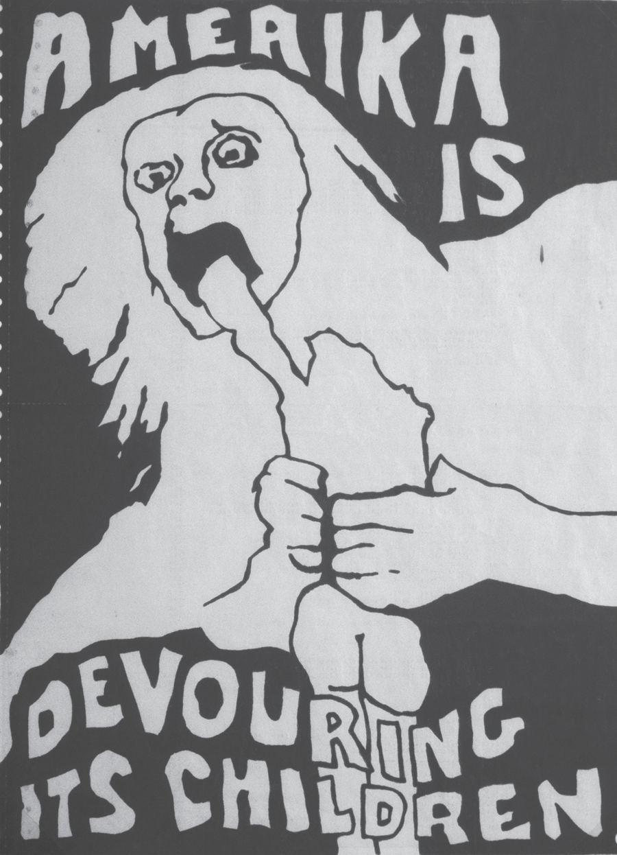
This state of affairs created an environment where artistic precedents of politically engaged work (individual works or movements) were not readily available and even difficult to find for those interested. Those which were accessible and which came to have added political significance attributed to them (because of challenging exhibitions or scholarship) during the 1960s included Dada, which influenced the activities of politically attuned performance artists, and Russian constructivism.52 There were also the works of Francisco Goya, whose Saturn Devouring His Children and Disasters of War appeared in antiwar posters, such as Jay Belloli’s Amerika Is Devouring Its Children (fig. 11). And then there was the example of Picasso’s Guernica. Although Picasso created other explicitly political paintings in the postwar period, such as 1951’s Massacre in Korea, Guernica was the lone political work that was able to truly slip through formalism’s barriers and both subtly and explicitly affect Vietnam-era antiwar production.
Guernica—in its entirety, or portions of it—throughout the years of the war would either be directly appropriated or serve as a kind of template for the creation of a range of Vietnam-era artists’ protest works (from posters to political actions), which attempted to have a dialogue with the past (fig. 12).53 The work was quite familiar to American artists in the 1960s because of its loan to MoMA since 1939 and its international renown. The connection Vietnam-era artists made between Guernica and the Vietnam War suggested that what Picasso represented in his painting paralleled the inhumane actions of the United States in Vietnam. Guernica depicted the 1937 total destruction of the ancient Basque town of Guernica by the German Condor Legion, operating with Francisco Franco’s consent during the Spanish Civil War. Guernica was the cultural capital of the Basque people and the bombing did not have any strategic military targets but was used to break the Basque resistance to Franco’s forces. Guernica served as a testing ground for a horrific Nazi military tactic that would be used during the subsequent world war: the carpet bombing of a civilian population to demoralize the enemy. Picasso had given the painting to MoMA on extended loan in 1939 to enable it to travel internationally—which it did until the late 1950s—and also to keep the painting from Spain until the resumption of democracy in the country. (The painting was finally returned, as a symbolic gesture, to Spain’s new democratic government in 1981.) Guernica’s relationship to American artists during the Vietnam War may have been accentuated by the fact that in the summer of 1967, MoMA organized a special thirtieth-anniversary exhibition of the work, which included fifty of Picasso’s studies for the painting.54
11. Jay Belloli, Amerika Is Devouring Its Children, 1970. Silkscreen. 55.9 × 38.1 cm (22 × 15 in.). Courtesy of the Center for the Study of Political Graphics.

12. Artist unknown, Stop the War in Vietnam Now! circa 1970. Offset. 44 × 56 cm (17-5/16 × 22-1/16 in.). Courtesy of the Center for the Study of Political Graphics.
It also must be said that various doves created by Picasso were also reproduced or referenced during the late 1960s in American protest posters as symbols of peace (fig. 13). On the one hand, the use of the dove as a symbol of peace during the 1960s may seem straightforward. The dove historically symbolized peace (as well as spirituality and resurrection) in both the Christian and non-Christian world, and had been used previously during the twentieth century as an antiwar symbol, such as in John Heartfield’s The Meaning of Geneva (1932).55 On the other hand, for an older segment of the antiwar movement, the dove was firmly communist. Between 1947 and the early 1960s, Picasso’s doves were internationally recognized, central symbols of the Communist Party’s “Peace Movement.”56 The Peace Movement was a nonmilitary defense strategy of the Cold War, positioned against American imperialism and orchestrated by the Communist Party—though publicly it was presented as an intellectual and politically nonaligned movement.57 Communist intellectuals would write in publications and speak at conferences and congresses in support of peace and communist ideals, and against what they saw as American warmongering during the Cold War. The movement, according to Gertje Utley, author of Pablo Picasso: The Communist Years, was “the most powerful non-military weapon that the Soviet Union set up to confront NATO.” According to historian Tony Judt, “From 1946 to the death of Stalin no other topic so dominated public discussion [in Europe].”58 Importantly, Picasso was not just contributing his doves to the movement but was a prominent, active member both of the Peace Movement and of the Communist Party itself from 1944 until his death in 1973.
Because of the Peace Movement, Picasso’s doves became familiar around the world. One of the first uses of his doves was actually a pigeon Picasso made (which the symbolist poet and Communist Party official Louis Aragon decided to call a dove) in a poster for the first Congrès mondial des partisans de la paix in 1949. Soon after, the original (and more often, new, highly simplified line-drawing versions) showed up on backdrops for political rallies, as well as on posters, schedules, and pins all across Europe.59According to Utley, Picasso’s doves subsequently appeared on the front page of the New York Daily Worker, on posters in Japan, on postage stamps in China and the Soviet Union, and on the stage curtain for Bertolt Brecht’s Mother Courage and Her Children in the theater of the Berliner Ensemble. In France, Picasso’s dove became so well-known that it rivaled the post office’s calendar and Millet’s Angelus in popularity, according to Utley. The last major use of a dove by Picasso was for the July 1962 World Congress for Disarmament and Peace in Moscow.
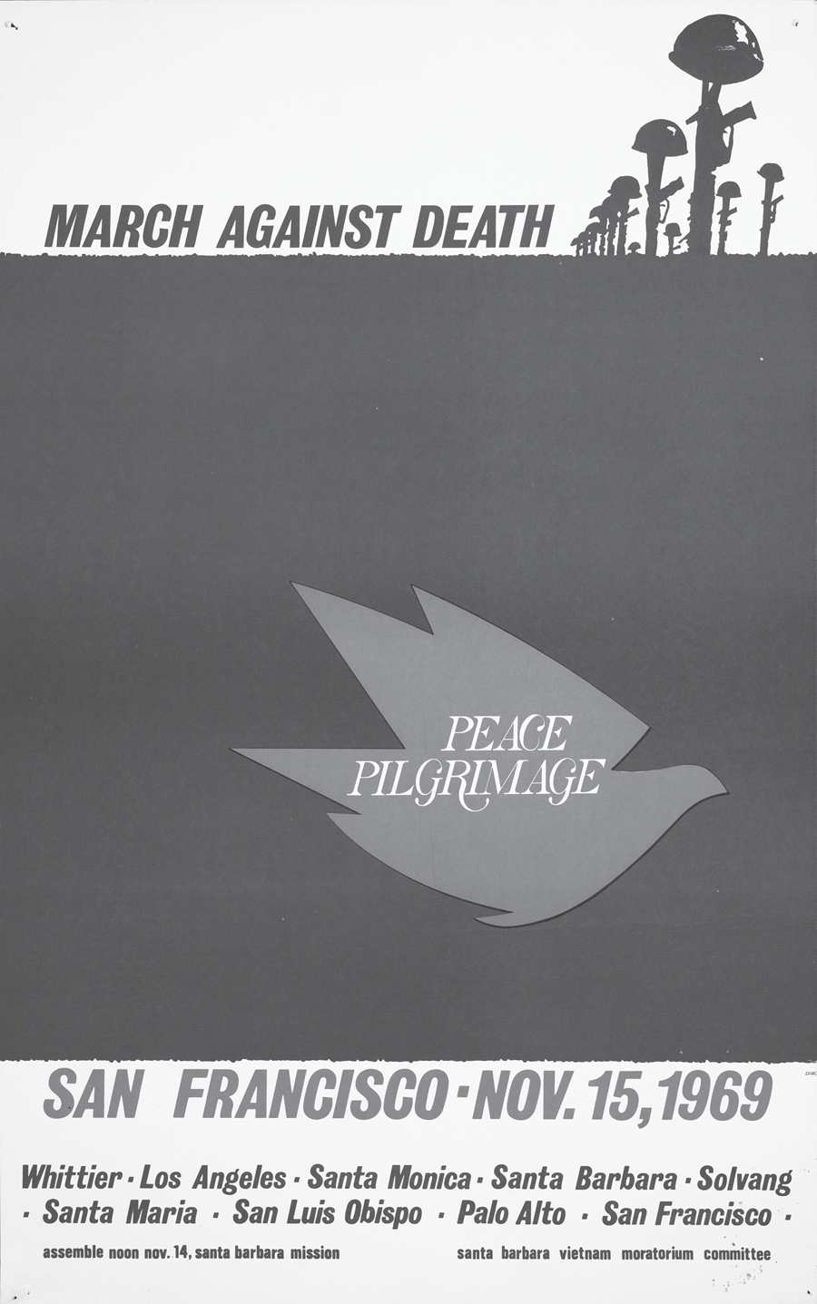
13. Vietnam Moratorium Committee, March Against Death Peace Pilgrimage, 1969. Offset. 54 × 34 cm (21-1/4 × 13-3/8 in.). Courtesy of the Center for the Study of Political Graphics.
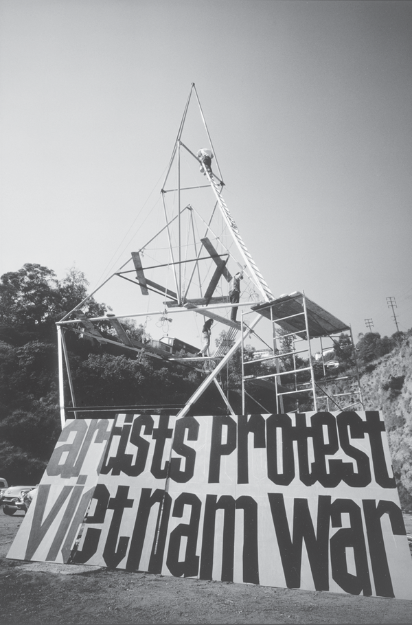
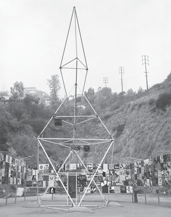
APC conceived its idea for the Peace Tower in 1965. The idea stemmed from the group’s desire, in the wake of its previous activities, to make a substantial, collaborative, “visual statement about the war” that would simulate public opinion and debate, and the group raised roughly $10,000 to create it.60 Robert Rauschenberg and William Copley were two of the major donors. Petlin spearheaded the tower’s organization.61 Other significant people from APC involved in the project were Judy Gerowitz—who later became known as Judy Chicago—and her husband, the sculptor Lloyd Hamrol.62
Eventually completed on February 26, 1966, the tower stood on a highly visible rented lot at the corner of Sunset and La Cienega Boulevards in Los Angeles and consisted of two parts. The major part was a hollow, fifty-eight-foot-tall tower constructed of steel poles painted yellow and purple. The tower’s shape was quite complex. It was an octahedron, tetrahedron, and double tetrahedron tensional configuration, which was a variation of Buckminster Fuller’s tensegrity constructions.63 The sculptor Mark di Suvero designed the tower. Though he lived in New York at the time, di Suvero was in Los Angeles in late 1965 and became involved with APC as a result of his show at the Dwan (which was highly acclaimed in Artforum, among other places).64
The other part of the tower was a ten-foot-tall, one-hundred-foot-long billboard that was affixed to the base, eight feet off the ground. At the foot of the billboard was a large sign—of black lettering on a yellow ground—which read “Artists Protest Vietnam War,” and covering the billboard were hundreds of two-foot-square weatherproof painted panels. The panels had been sent in by individual artists to be installed on the billboard in response to a bulletin APC distributed internationally in 1965.65 The bulletin had asked artists for panels that would express their dissent. So many contributions were received—allegedly 418—that all the panels could not fit on the billboard and many had to hang on the lot’s surrounding fence.66
Those who donated panels to the project were by no means only “political” or “figurative” artists (as might be gathered from the number of artists involved) but were working in a range of styles. At the same time, the panels did not diverge markedly and can be understood as existing in three different categories.67 The most prominent type of panels—by artists such as James Rosenquist (again, one of the few pop artists to engage at points with war and politics during the 1960s), Elaine de Kooning, Alice Neel and Rafael Soyer—featured quick, furious, rant-like slogans or symbols that often strayed from an artist’s characteristic style. Rosenquist’s contribution simply said “Body Count” in large letters. Neel created a skeleton that was burning up in flames behind the words “Stop the War.”68 A second group of panels were those created in an artist’s recognizable style but altered in some way to reflect a desire for peace or a halt to the war. Panels by Rudolf Baranik, Golub, and Lichtenstein—the other significant pop artist to engage (in a few situations) with the war—fell into this category. A third group of artists, including Donald Judd and Tom Wesselman, made what I have called benefit works. As mentioned previously, these were works done completely in an artist’s recognizable style, with no adjustment for the needs of a specific event or effort (i.e., there was no discernible antiwar content), but which were contributed to benefit the event or effort, whether financially or because the artist’s reputation would add import to the cause.
The tower opened to the public in a dedication ceremony on February 26, 1966. Susan Sontag and Donald Duncan spoke at the ceremony. Duncan was a former member of the U.S. Army Special Forces and the author of a searing and influential critique of American involvement in Vietnam published in Ramparts that same month.69 Sontag’s speech announced that with the creation of the tower, those against the war were expanding their activities. No longer were those involved in the antiwar movement solely writing members of Congress and signing petitions, Sontag explained, but through the means of the tower they were “establishing a big thing to stand here, to remind other people and ourselves that we feel the way we do.”70 As Julia Bryan-Wilson has written, Sontag’s use of the less-than-eloquent term “big thing” as a way to describe the effort can be read as a reflection of the basic “uncertainty” of Sontag—who was one of most eloquent critics of the twentieth century—about the tower, and in a larger sense, the American avant-garde’s lack of faith in “objects” or “big things” as a form protest. This lack of faith would continue to be present in the (again) predominantly formalist American avant-garde throughout the years of the war.71
While those involved with the tower hoped it would exist until the end of the war, from the moment of its inception its future was uncertain. Though guarded twenty-four hours a day, it was threatened and attacked during and after its construction, and according to Petlin, some of the attacks were aided by the Los Angeles Police Department’s lack of sympathy for the project.72 One of the worst attacks found Petlin defending the tower with a sparking light stanchion against a crew of marines bent on tearing it down. Coverage of this incident appeared in the New York Times and inspired Frank Stella—despite his own formalist stance—to donate $1,000 to the cause. Stella explained that he gave the money because “any artist who would risk his life defending a work of art deserves my support.” The owner of the lot in which the tower stood also tried to evict APC. He was furious because APC did not disclose their intention to build a huge antiwar statement when they rented the lot, and he would have never approved the lease if he had known.73
These problems led APC to shop the tower around to see if it could be moved somewhere else. APC approached the Pasadena Art Museum, the Center for the Study of Democratic Institutions in Santa Barbara, and the Institute for Policy Studies in Washington. Despite APC’s efforts, there were no takers, primarily because, according to Therese Schwartz, the work was too politically unrestrained to be exhibited.74 As a result, APC decided to disassemble the work and not reinstall it when their lease expired. Upon its disassembly, sections of the tower’s steel poles were compressed into square “pillows” and distributed to the individual participants as mementos. The panels were wrapped in brown paper and auctioned off anonymously at a local peace center.75 According to Petlin, this auction raised roughly $12,000 and benefitted the California Civil Liberties Union, which was “trying to get . . . out of jail” people who were being denied bail.76
In New York during 1966, a few artists began to incorporate antiwar sentiment into their works of art. The most visible instance was Marc Morrel’s December 1966 exhibition at the Stephen Radich Gallery, in which Morrel—a marine, freshly back from Vietnam—installed thirteen constructions all featuring the American flag (fig. 14). Among the constructions was a flag draped in chains, a flag shaped as a phallus on a cross, and a flag suggesting a symbolic figure hanging from a yellow noose. Antiwar songs played in the background. Morrel’s sculptures became well-known not on their own merits, but because Radich was arrested and charged with violation of the state penal law stating that “no person shall publicly mutilate, deface, defile or defy, trample upon or cast contempt upon the American flag.”77 (While this law has since been repealed, there continue to be events that revive interest in it and Congress has consistently attempted to pass a constitutional amendment to allow the government to ban flag desecration.) Radich’s arrest garnered a great deal of publicity because it seemed so ridiculous. Yet surprisingly, Radich was eventually found guilty, even though the American Civil Liberties Union stepped in to defend him.78
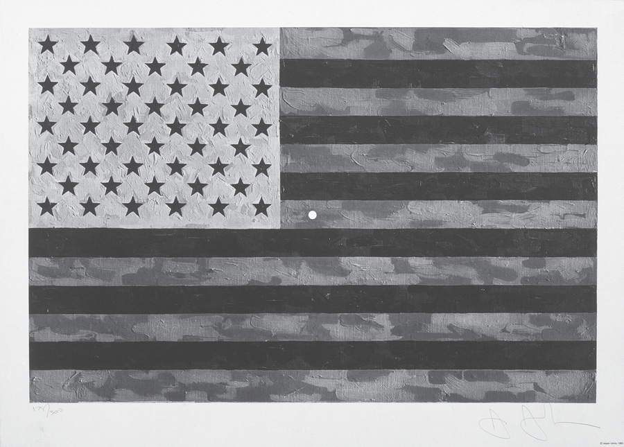
When asked about his work in a 1967 panel discussion, Morrel explained that he saw the flag as “the one symbol that could reach people other than a burnt or bloody doll or a draft card.”79 Other artists agreed with Morrel, and in the years after his exhibition, numerous antiwar works employed the American flag. Most, like Morrel’s works, defaced the flag and relied on this strategy to express an anti-American sentiment. Obviously, this was nothing new, as desecrated flags had historically been used in the United States and many other countries to express dissatisfaction with one’s government. In 1969, for example, Jasper Johns—who was already famous for his painted American flags of the 1950s—created Flag (Moratorium) (fig. 15) for the first Moratorium to End the War in Vietnam in October 1969. The Moratorium—literally a suspension of activity—was the largest national antiwar protest to occur during the war. Millions of Americans in thousands of cities, towns, and villages across the United States participated, and in the months and years following, several other similar moratoria occurred. Johns’s print was a toxic green, black, and orange version of the stars and stripes—the retinal reverse of red, white, and blue, signifying the upended state of the union. Directly in the middle of the work, Johns punched a small, perfectly round circle that for most viewers signified a bullet hole. At best, the bullet hole was a stray shot from the antiwar movement. At worst, it was a bull’s-eye through the heart of the United States, the kill shot in a diseased body.80Johns’s inverted flag became a familiar icon of the period. Initially sold by Leo Castelli Gallery in an edition of three hundred signed prints as part of a benefit exhibition for the Moratorium, it subsequently was made into a mass-produced poster, bringing awareness of the event to a much larger audience.81
14. Installation view of Marc Morrel flag works at the Stephen Radich Gallery, December 1966. Courtesy Marc Morrel and Art in America.
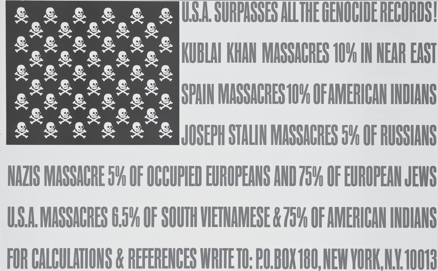
Another iconic work based on the American flag was Fluxus cofounder George Maciunas’s 1966 U.S.A. Surpasses All the Genocide Records (fig. 16). Like Johns’s work, Maciunas’s flag included subversive imagery within its design. Yet Maciunas’s meaning was much less subtle than Johns’s. Fifty skulls replaced the fifty stars in its canton, undeniably converting the flag from a patriotic symbol to one of danger, poison, and death. Additionally, where there would be stripes, bluntly written in capital letters was a catalog of historical genocides, all to conclude that the United States is the historical leader in the deliberate or systematic destruction of people. The poster read, “U.S.A. SURPASSES ALL THE GENOCIDE RECORDS! KUBLAI KHAN MASSACRES 10% IN NEAR EAST; SPAIN MASSACRES 10%OF AMERICAN INDIANS; JOSEPH STALIN MASSCARES 5% OF RUSSIANS; NAZIS MASSACRE 5% OF OCCUPIED EUROPEANS AND 75% OF EUROPEAN JEWS; U.S.A. MASSACRES 6.5% OF SOUTH VIETNAMESE & 75% OF AMERICAN INDIANS; FOR CALCULATIONS AND REFERENCES WRITE TO: P.O. BOX 180, NEW YORK, N.Y. 10013.” Importantly, though Maciunas utilized language like that of other artists of the period, his use was not an escape from his typical mode of expression since text had always been one of his primary mediums.
15. Jasper Johns, Flag (Moratorium), 1969. Offset lithograph in colors. On wove paper, signed in pencil. Lithograph: 17-1/4 × 26 in. Sheet: 20-1/2 × 28-5/8 in. Published by the Committee Against the War in Vietnam. Edition of 300. Art © Jasper Johns and ULAE, licensed by VAGA, New York.
16. George Maciunas, U.S.A. Surpasses All the Genocide Records! 1967. Offset. 54 × 88 cm (21-1/4 × 34-5/8 in.). Courtesy of the Center for the Study of Political Graphics.
By far the most important use of the American flag as an antiwar statement, next to Morrel’s exhibition, was the People’s Flag Show, which would be held at the Judson Memorial Church in November 1970. As Bradford Martin has explained, in 1970 “the issue of artists’ appropriations of the flag [again] loomed in the public eye” in part because the Radich case was pending before the U.S. Supreme Court.82 Organized by Jon Hendricks, Jean Toche, and Faith Ringgold, the Flag Show sought to challenge flag desecration laws and welcomed submissions (via an ad in the New York Times) from sympathetic artists and citizens. A poster advertising the show declared, “A flag that does not belong to the people to do with as they see fit should be burned and forgotten.” The organizers also asserted that the flag “should be available to the people to stop killing.”83
Critics reviewing the show in the Times and the Village Voice found most of the works to be of low artistic quality.84 Examples of inclusions were a “baked flag cake, a flag constructed of soft drink cans[,] . . . a flag in the shape of a penis,” and a “flag draped over a toilet bowl.”85 There were a few, more nuanced pieces, however, such as Yvonne Rainer and her dance troupe Grand Union’s nude dance with flags. Abbie Hoffman also contributed a speech that he delivered in a flag shirt, which he had been arrested for wearing in 1968. During his talk Hoffman ostentatiously made a gesture of wiping his nose on the shirt’s cuff.86 Like Morrel’s show, the Flag Show became historically significant because it prompted the arrest of its organizers. This occurred on November 13, 1970, when the police took away Hendricks, Toche, and Ringgold (who became known as the “Judson Three”) and closed down the show a day before it was supposed to end.87 Eventually (even though like Radich, they received help from the ACLU) a federal court found the three guilty of flag desecration.88
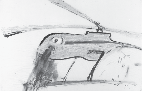
17. Nancy Spero, Gunship, 1966. Gouache on paper. Framed: 27-1/2 × 39-1/2 in. (69.9 × 100.3 cm). Art © Estate of Nancy Spero/Licensed by VAGA, New York. Courtesy Galerie Lelong, New York.
Concurrent with Morrel’s exhibition, in 1966 Nancy Spero began her War Series (fig. 17), which she would continue to work on until 1970. Spero’s essential strategy in the series was disfiguration, and her works, like others created over the course of the war by Roy Lichtenstein, Nancy Graves, Bernard Aptekar, and Arnold Belkin, sought to disfigure American war machines, particularly the weapons of the U.S. Armed Forces.89 Originally conceived in the middle of the night as throwaway works (akin to graffiti or posters) that no one would see, Spero’s series turned American weaponry into predatory serpents or insects, or male genitalia, which often rooted war-making in the male sex drive. A stiff erection becomes a blood-spewing atomic bomb, or an airplane raining down a liquid hell reminiscent of clotted blood. A helicopter turns into a sickly fish (with long, birdlike legs), which vomits a torrent of dead bodies in a shower of blood and excretes a small pile of bones. A fleet of planes appears as large gray dragons labeled “F.U.C.K.” that swoop down with naked people in their jaws, spraying blood. Missiles and bombs become flies; a bug coexists with a helicopter and victim; planes look like beetles; and another helicopter becomes a defecating slug. Spero’s painting technique reinforced the crudeness of her works. Gouaches were severely washed out, smeared across the newsprint, often in muddied browns, as if the medium were feces spread on the wall by someone psychologically unstable.
Judith Bernstein’s Supercock series of drawings—done while Bernstein was a student at Yale—directly relate to Spero’s works. Yet because they associate only weapons and penises, and do not complicate the depiction through, for example, the inclusion of serpent imagery, the resulting effect is more one-dimensional than that achieved in the War Series. Their presentation was also less remarkable compared to Spero’s nuanced, smeared approach. Then again, Bernstein’s 1967 Fun Gun (fig. 18), a diagram of the male reproductive system, which included real bullets and transformed the penis into a lethal automatic weapon, is a wonderful and powerful counterpart to historical male mechanizations of the female by Picabia and Duchamp, and can be likened to contemporary sexualized diagrams by Warhol as well as Lee Lozano’s gray tool renderings.90
In later years posters took up the themes of Spero’s and Bernstein’s works. One example was a 1970 poster created by the Committee for the Promotion of the Selective Youth in Asia (a fake organizational name that punned on selective euthanasia), titled My Lai(fig. 19). The poster featured a pinup shot of a naked white soldier (identified through a gas mask pulled back on top of his head and a tattoo of a large heraldic eagle on his chest). His hands are pulled back behind his head and he flaunts his wares: in place of his penis, three large antiaircraft guns jut out and below them, where his testicles would be, hang two grenades.
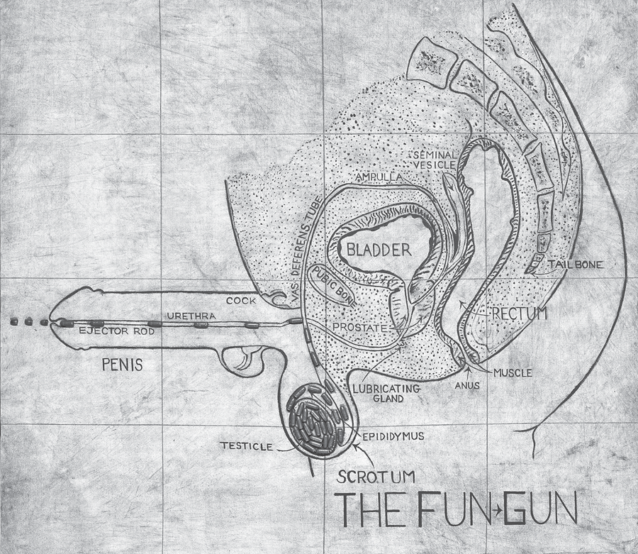
18. Judith Bernstein, Fun Gun, 1967. Acrylic on canvas with collaged .45 caliber bullets. 57 × 60 in. Collection of Paul and Karen McCarthy. © Judith Bernstein.
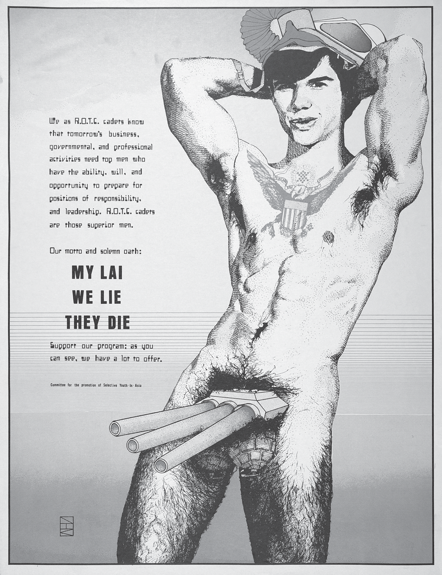
19. Jeff Kramm, My Lai, 1970. Offset lithograph. 24 × 18 in. © Jeff Kramm. Courtesy Lincoln Cushing.
It is important to note that these grotesque and provocative sexualizations stood at odds with the sexiness often attributed to American weaponry at the time (and since), especially among the armed forces. A telling comparison is between these works and Michael Herr’s description of American helicopters in Dispatches, his memoir of his time embedded with the army during the Vietnam War.91 Herr saw the helicopter as “pure sex.”92 He wrote, “In my mind it was the sexiest thing going; saver-destroyer, provider-waster, right hand–left hand, nimble, fluent, canny and human; hot steel, grease, jungle-saturated canvas webbing, sweat cooling and warming up again, cassette rock and roll in one ear and door-gun fire in the other, fuel, heat, vitality and death, death itself, hardly an intruder.”93 In this way, Herr sees the helicopter as a kind of entertaining and endlessly responsive female sex toy, available to move with him wherever he desired, and receive whatever his aggression and desire to destroy had to give. Additionally, what cannot be omitted from any discussion of Spero’s War Series or Bernstein’s works is the fact that these women made these figurative, topical, ephemeral works in a spirit of anger, not just against the war, but also against the New York art world. Even though the War Serieswould eventually be hailed as predicting feminist production (particularly through its sexualization of weaponry), its almost deliberate rejection of the current New York avant-garde aesthetic meant it was relegated to the periphery.94 Spero and Bernstein’s physical and ideological location at the margins of the New York art world bore little relation to that of the U.S. government, where the following year the war was seen as moving in the right direction.