CHAPTER 7
The imminent transformation to quantification continues apace, although the journey is neither simple nor direct. The themes take a while to coalesce: the integration of nebulous societal forces with methodological advances in mathematics and statistics, highlighted by the invention of probability theory. At a very human level, it presages an intersection between the everyday life of ordinary people and the scholarly activity of some prominent mathematicians. Our storyline, moving toward a transformed worldview, follows these two interrelated and codependent tracks. And so, we follow them on the two land masses on which they had the most impact: the Americas and the larger European continent through Eurasia.
As more immigrants arrived in America, the fieriest of the Puritans were losing influence, although a more tolerant version of their belief was still staunchly held by a substantial group. Reason was settling in on both sides of the ocean. Reason gives a door to quantification in thinking and outlook.
This same sense of purpose drove the western expansion of the United States, which began with the journey of the Corps of Discovery, the party of explorers led by Meriwether Lewis and his gregarious friend William Clark, the team history just calls “Lewis and Clark.” They reached the Oregon coast in 1806 with help from several Native American tribes and individuals, the most famous of whom is the young woman Sacagawea, who acted as their guide. Lewis expressed this spirit of self-determination when he wrote the following in his journal:
We are about to penetrate a country at least two thousand miles in width, on which the foot of civilized man had never trodden; the good or evil it had in store for us was for experiment yet to determine … [yet] entertaining as I do, the most confident hope of succeeding in a voyage which had formed a da[r]ling project of mine for the last ten years, I could but esteem this moment of my departure as among the most happy of my life. (Lewis and Clark (1804–6) 2005, Lewis, April 7, 1805)
In Europe, things were quite different. Notably, the French Revolution had ended only a few years earlier, bringing the ascent of Napoleon Bonaparte in the late 1790s. Although hardly benevolent, given his own brutal excesses, the young general did bring to an end the chaotic, bloody twelve-year revolution. Knowing how this period came about is useful to us because the period to follow (the beginning of the long century, from after the Congress of Vienna and onwards) is largely a reaction to it, and it is an era where many significant quantifying events happened.
During the period leading up to the French Revolution, nearly everyone in France was poor and ill-served by an absolute monarchy and a nobility-laden government that was increasingly out of touch with the people it ruled. Those in the governing class lived lives of conspicuous excess. When the people complained that they did not even have enough bread to eat, the young queen of France, Marie-Antoinette, allegedly uttered what is one of the most infamous quotes of all time: “Qu’ils mangent de la brioche” (“Let them eat cake”). Historians doubt the quote’s authenticity, but the reality of despotic rule by a debauched nobility is indisputable.
The culture of entitled privilege by the nobles led motivated groups of determined protesters to storm a weapons fortress in Paris—the Bastille Saint-Antoine—on July 14, 1789, almost the exact day that the new US Constitution went into effect (it had been ratified one year before). The protests by ordinary Frenchmen almost immediately grew to include virtually all the peasants and anyone outside of the government. The French Revolution had begun.
The monarchy fought back with almost unimaginable savagery. They ordered French troops to carry out a bloody campaign in which many thousands of protesters were killed. Any peasant even remotely suspected of not supporting the government was brutally killed by the soldiers; many were shot at point-blank range. The crackdown’s most intense period was a horrific ten-month Reign of Terror (“la Terreur”) during which the government guillotined untold masses (some estimates are as high as 5,000) of its own citizens as a means to control them.
One of the architects of the Reign of Terror was Maximilien Robespierre, a French nobleman and lifelong politician. He explained the government’s slaughter in unbelievable terms, as “justified terror … [and] an emanation of virtue” (quoted in Linton 2006). Slowly, however, over the next few years, the people gained control. In the end, many nobles, including King Louis XVI and his wife Marie-Antoinette, were themselves executed by guillotining. Some of the atmosphere of the French Revolution is captured in a well-known drawing, which is shown in Figure 7.1; it was printed at the time with the heading “Execution of Robespierre and his conspiratorial conspirators against freedom and equality: long live the National Convention which by its energy and surveillance has delivered the Republic of its tyrants.” It is not known who made the drawing originally.

Figure 7.1 Drawing of La Terreur in France, “Execution of Robespierre”
(Source: http://commons.wikimedia.org/wiki/Category:Public_domain)
The most lasting consequence of the French Revolution, however, was not ending the rule of a monarch and enshrining a popular sovereignty but fixing in people’s minds the ideals of the Enlightenment, namely, reason and self-determination. This new atmosphere, cleansed of the oppressive aristocrats, gave rise to much intellectual development. A kind of cognitive release began to grow in the minds of ordinary people, leading to a mindset that viewed things quantitatively. In unseen but profound ways, people gained a sense of control over their lives. It moved from their thoughts to their daily behaviors. The tremendous mathematical advances of this period are a direct manifestation of the refreshed social environment.
* * * * * *
One of the most profound developments in probability theory—indeed, in all mathematics—happened in the opening years of the nineteenth century in France and, almost simultaneously, but independently, in Germany. This is the invention of the “method of least squares.” At its essence, least squares is a data-handling technique that specifies, for plotted data, where a line may be drawn through or close to many of the individual data points. The line can then be interpreted to give information about the data variable(s). This is useful to understanding how different variables relate to one another, and it allows for mathematical prediction. As we will see, it is one of the most amazing numerical inventions of all time. It is truly that significant.
Least squares, as a route to regressions, is routinely employed in virtually all quantitative fields of endeavor, including statistics, engineering, aerospace, medicine, economics, and more. The invention of the method of least squares is a watershed moment in quantification, too, because of its focus on predicting and forecasting. Using mathematics to anticipate events and phenomena is given first light with the method of least squares.
It was invented twice; that is, two individuals working at roughly the same time, but independently, came to invent it, although in slightly different forms: Adrien-Marie Legendre and Carl Gauss. Its first public architect was Legendre. Immediately upon Legendre’s publication of his version of least squares, its importance was recognized by scholars and academics as a significant advance in data handling. Without hesitation, it seems, they adopted the method in their own work.
Clearly, the method of least squares presaged other important developments in the field, setting probability theory on a trajectory to become a major player in mathematics. The preeminent historian of statistics, Stephen Stigler, remarked about its astounding acceptance and widespread use: “The rapid geographic diffusion of the method and its quick acceptance in these two fields [astronomy and geodesy], almost to the exclusion of other methods, is a success study that has few parallels in the history of scientific method [sic]” (Stigler 1986, 15)—impressive to think.
Inventing the method of least squares was the result of a concerted and determined problem-solving effort by several mathematicians to find a reliable way to predict the arcs (actually, moving ellipsoids) of stars and planets. They knew that such an accomplishment was possible with the new calculus inventions of Newton, Pascal, and Leibniz, as well as through Bayes’s theorem, but exactly how to approach a solution was less clear. Thus, they had defined the problem and identified a working strategy—but after that, seemingly nothing—a brick wall on predicting where planets and stars would move. The more mathematicians and astronomers looked at the problem, the more intractable it seemed. No one knew exactly what to do next.
At the same time, a practical circumstance closer to the daily lives of ordinary people came to light that made the quest for solution urgent. There was a sudden and important need at hand: namely, to determine longitude. As we saw earlier, with oceanic travel and trade made relatively safe from pirates (remember, Captain Kidd was captured and hanged in a public spectacle), Great Britain and several other countries sought to expand trade via early cargo shipping.
The two quests—determine the arc of certain celestial bodies and accurately fix longitudes—were interdependent. It was widely recognized that having dependable data on the movement of celestial bodies would be of enormous use to mariners for ocean navigation, a problem of knowing one’s longitude. (Precise estimates for latitude would come later.) At the time, finding one’s way by the stars while in the middle of an ocean was risky business because their relative position changed each night, and estimating their trajectories was done only by eye or perhaps with an inexact sextant. This gave a rough estimate of their static location, but, before Legendre’s work, mariners had no way to reliably predict the precise location of stars over time and thus learn their true longitude.
In reality, navigation was as much luck as anything else. Commonly, ships would sail off course, get lost, and travel to who knows where—often to their doom. The method of least squares provided a mathematical technique for making the necessary predictions for both the tracking of celestial bodies and then, following on that, for longitude.
Legendre studied the problem of determining arcs, which bore out his version of the method. Specifically, he was investigating the errors in measuring latitudes. He noted that, regardless of whether the errors were symmetric about the mean, he could summarize them through a process of linear combinations. Like Mayer’s early method of combining observations, then, Legendre was treating the data as a unitary whole, rather than focusing on its individual elements. This insight formed the beginnings of his method of least squares.
He published his efforts in 1805 in a well-received book titled Nouvelles méthodes pour la détermination des orbites des comètes (New Methods for Determining the Orbits of Comets) (Legendre 1805). But, surprisingly, the body of his book was not about least squares; rather, it was a long description of the problem itself, measuring arcs for latitudes. The method of least squares was mentioned merely as an application to solving the arc dilemma. Only in an appendix did he describe his method.
Further, and significantly, he did not provide a mathematical proof, which would have been an expected accompaniment to such a momentous invention. This omission is all the more surprising because he was knowledgeable in calculus and certainly able to do the proof. Even further, we learn through his later writings that he realized his invention’s importance. We do not know his reasons for the curious placement or incomplete description. Regardless, he is given credit for its first public account.
Meanwhile, Gauss also invented the method. In fact, he did so earlier than Legendre, but he did not publish an account of it until later. It is generally acknowledged that Gauss developed his approach first, possibly as early as 1794, when he was just eighteen years of age. But, he did not disseminate his solution until 1809, when he published Disquisitiones arithmeticae (Latin for Arithmetical Investigations but often translated as The Shaping of Arithmetic) (Gauss 1801, Gauss and Waterhouse 1986). I discuss this important work by Gauss more thoroughly in Chapter 9, in the context of Gauss’s life and other accomplishments.
For his part, Gauss approached the problem more mathematically and provided a calculus proof to his work. His version is slightly more complex than Legendre’s, and his version fits the more general case. It is the standard today.
Gauss acknowledged that Legendre published a solution sooner than he did, but he wanted Legendre to concede to him the earlier accomplishment, something Legendre refused to do. They quarreled about this attribution for the remainder of their lives, mainly in a series of letters to others. Gauss considered the method of least squares simple work, saying the reason he did not publish it sooner was that it was “so simple.” He said,
I had no idea that Mr. Legendre would have been capable of attaching so much value to an idea so simple, that rather than being astonished that it had not been thought of a hundred years ago, he should feel annoyed at my saying that I had used it before he did. (Quoted in Gorroochurn 2016a, 165)
Then, pouring salt on Legendre’s wounds, Gauss added,
Therefore, in my theory of the motions of planets, I was able to discuss the method of least squares, which I have applied thousands of times during the last seven years. (Quoted in Gorroochurn 2016a, 165)
Ouch!
In support of Gauss, there is no doubt that he employed the method several times in his work prior to Legendre’s publication of it. But realize, too, that many advances in mathematics, beyond the method of least squares, were simultaneously invented or discovered by two or more people. In fact, it was not unusual for several mathematicians to independently invent or advance some procedure or another at about the same time. Moreover, at this time, advances in mathematics and allied fields such as statistics and probability theory were coming on fast and furious.
Another incident, too, led to their mutual dislike. To understand this dispute, consider a tremendously complex arrangement of numbers useful to higher mathematics, the “law of quadratic reciprocity.” Although the law was used by mathematicians, its potential was not reached at first because it had no accompanying proof, making it somewhat suspect. Legendre tried again and again to provide a justifiable proof. Eventually, he gave up, saying it was too difficult. Gauss, however, at age nineteen developed a full proof. He continued to work on the problem over the years and eventually established six other proofs, and then went on to demonstrate that there are no further proofs!
There is no record of how each man reacted, but we know that Gauss was private and taciturn in his manner, whereas Legendre was quick to show anger and liked others to know about his accomplishments. I imagine that, upon learning of Gauss’s proofs, he must have seethed in rage and jealousy (only conjecture, of course).
Legendre was elementary, too, in his approach to the problem of predicting the arc for celestial bodies, starting with observation. He said:
I have thought that what there was better to do in the problem of comets was to start out from the immediate data of observation, and to use all means to simplify as much as possible the formulas and the equations which serve to determine the elements of the orbit. (Quoted in Gorroochurn 2016a, 165)
Note, particularly, that he gathers his data initially from that stalwart of our story: observation. In this account of quantification, all follows from it.
Unfortunately for Legendre, despite the widespread and lasting impact of his method of least squares, as well as the overall importance of his full mathematics canon (as we shall see, it was voluminous), he did not enjoy a high reputation while alive. But that did come later, after his death, and today Legendre is regarded as a mathematician of enormous stature. His name is one of only seventy-two names inscribed on the Eiffel Tower.
While there once, I looked for his name, but in truth it is difficult to see any of the names from the ground, as their lettering (originally in gold) is now relatively obscure and placed high up. The seventy-two inscriptions are located on the sides, under the first tower. Gustave Eiffel chose the names himself as an “invocation of science.” I hope you have an opportunity to see the inscriptions, too, because viewing Legendre’s name on the impressive Eiffel Tower engenders a sense of awe at his accomplishments.
Another of Legendre’s achievements puts quantification in a touchable perspective. He developed a theorem relating to spherical triangles, a methodology useful for drawing triangles on the surface of a spheroid, particularly one that is elongated, like the prolate shape of a football. This can be seen by imagining using a marker to draw a triangle shape on a football—harder than it seems. Legendre’s theorem defined this shape mathematically, which has application for figuring shapes and distances on many celestial bodies, including some moons and asteroids. Somewhat later (in 1790), a French astronomer with the unwieldy name of Jean Baptiste Joseph Delambre used Legendre’s theorem to specify the exact length of the meter.
While many of our main characters (e.g., Newton, Bernoulli, and de Moivre) came from comfortable beginnings, Legendre had even greater childhood comfort, being born into a wealthy family. But, like de Moivre, he became infirm in later life and died poor because his pension was initially withheld (though later restored) by the French government due to his lack of support for the government-backed candidate at the Institut National, the Comte de Corbière, Ministre de L’Intérieur (Legendre 1810). Sadly, another of these most accomplished persons came to an unhappy ending.
Then, as if to add insult to injury, there is the fact that we simply do not know what he looked like. We presume that Legendre was at least ordinary in appearance; however, the only known portrait of him is a caricature in which he looks anything but normal. The drawing shows him with enormous, flailing white hair and the scowl of a junkyard bulldog. See for yourself in Figure 7.2.

Figure 7.2 Caricature of Legendre
(Source: http://commons.wikimedia.org/wiki/Category:Public_domain)
It gets better: for nearly two hundred years, until 2005, books and other publications printed the profile portrait of a handsome, distinguished-looking man as Adrien-Marie Legendre. But, it turns out that it was not him at all! It was a case of mistaken identity. The two-centuries-old portrait was that of an obscure French politician named Louis Legendre—a man with the same last name but a different first name. So today, only the caricature survives as representation of one of the most famous mathematicians of all time. We know the appearance of virtually all other famous and accomplished persons within the last two hundred years or more, but not of Adrien-Marie Legendre. Alas—look again at the caricature and realize this man is an important figure in our quantification story. Dare I say, he influenced you because his achievements helped to fundamentally shape how we all view the world.
* * * * * *
Now, on to describing the method of least squares. My description is rather basic, because our focus is on how the method advances quantification rather than on didactic explanation. Overall, the method’s math is relatively simple, although a complete explanation includes linear algebra and the proof is by calculus.
For those interested, however, a more complete description is available via dozens of textbooks and websites, albeit with varying levels of sophistication and quality of description. One historical source on least squares is Brunt’s classic The Combination of Observations (1931). This detailed account of the method provides a complete description, its calculus proof, and a lengthy commentary on when it may be appropriately used in experiments. While decidedly dated in approach and writing style, this work is significant and has been called “culturally important.” It may be particularly useful to those interested in the method itself and its development, rather than as an introduction.
Understanding the method begins with an awareness of correlational relationships. While we all know that a mathematical correlation does not automatically prove causation, variables are commonly suggestive of one another, often to some meaningful degree. Though seemingly obvious, keeping this fact at the fore is extremely helpful in understanding exactly how the method of least squares works. Generally, the correlational relationship is only partially established. In fact, unless a correlation is perfect (r = 1.0), the relationship is always only partially determined. This means that when just two variables are considered, one of them does not fully correspond to changes in the other; rather, it offers only a partial explanation, and sometimes even just a hint.
When the method of least squares is employed in regression (its most frequent use), the variables involved are classified as either “dependent” or “independent.” In regression terminology, the dependent is regressed onto the independent variable, signifying that changes in the independent variable (regardless of whether such changes are naturally occurring or the result of experimental manipulation) can explain at least some of the change in the dependent variable.
With this information set, several useful concepts come into play. One of them is to determine whether the relation between the variables is linear or nonlinear. This determination is made by considering the full range of values for the variables. A truly linear relationship signifies that two variables change uniformly throughout their full ranges. In other words, low, middle, and high values for one variable are matched by exactly corresponding changes for low, middle, and high values in the other variable: a change in one is matched by an identical (or exactly proportional) change in the other.
In real-world research, however, it is rare for two variables to behave so consistently. Following a strict criterion like this could hamper both research and other useful interpretations. Thus, in most contexts, if the relationship between two variables is fairly consistent throughout the scale (generally, with only minor deviations at the extremes), we treat them as linearly related, putting up with the slight inaccuracy. For example, most of the time, we treat people’s height and weight as linearly related variables, knowing that some exceptions exist. (For the technical purist, there is an ever-so-slight inaccuracy in my description of linearity: for there to be true linearity between variables, they must also possess a characteristic called “homoscedasticity”—but that is beyond our scope to describe here.)
Linear relationships are the kind of relationships we mostly imagine in everyday thinking. Some instances are when figuring out profit over time, calculating mileage rates, or predicting which team will win a sporting event. Even without plotting the relationship on a graph, our minds instantaneously gauge a linear relationship.
Nonlinear relationships between variables, however, are typically more complex and can take several forms. In one form of a nonlinear relationship, the two variables may relate consistently for part of the scale, but then deviate at other parts. For example, consider two common educational variables: test performance and test anxiety. Research has shown that a mild amount of test anxiety can be motivating and is positively related to increased test performance. But this holds true only for the lower end of the anxiety scale. As anxiety for examinees increases to the middle and upper values on the anxiety scale, test performance varies widely: for some students, their test performance is increased, but, for others, test performance actually declines. The variables, then, are inconsistent through the scales and not linearly related.
Further, in more complex nonlinear scenarios, the relationship may be cubic or even quartic, meaning the bends in the relationship curve may go up and down more than once, to two or even three times. Of course, at some point, the relationship is so inexact that there is deemed to be no relationship at all.
Figure 7.3 displays the two kinds of ways variables relate: linear and nonlinear. Two of them are linear (positive and negative), while the other is nonlinear (in this case, random).
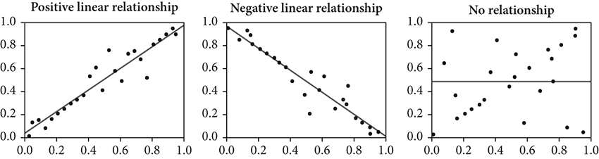
Figure 7.3 Correlational relationships: positive, negative, and none
In research contexts, statisticians have figured out ways to deal with these situations, such as transforming the variables’ scale to log or square root metric; however, such changes complicate the interpretation. These scenarios show how messy data can be, and that quantifying real-world events is never clean. As Roseanne Roseannadanna (a beloved character on the original Saturday Night Live TV show), when facing some perplexity, would say, scrunching her face, “It just goes to show ya. It’s always something. If it’s not one thing, it’s another. But, it’s always something!” True, true.
This is the point at which Legendre (and Gauss, but with a different approach) figured things out: namely, how to best represent these changing relations between (or among) variables and, in particular, how to accurately extend interpretation of them even when there is no new data. Recall that they were focused on solving the two interrelated problems of (1) determining the arc of certain celestial bodies and (2) accurately fixing longitudes. Both men were innovative thinkers, and they brought to the problem an entirely new perspective. Rather than see variation in the data as errors to be minimized, they viewed the data set as a unified whole and explored ways to represent it, in toto.
Their solution was to draw a line through the plotted data to represent the many values via a single feature. This line is called the “line of best fit.” The name is apt because, graphically, when all the observed data points are plotted on the x- and y-axes, a straight line can be drawn through them that is as close to all of them as possible. In other words, any other line drawn through the separate data points would not be closer to them: hence, it is literally the best-fitting line to the data. Obviously, in only one circumstance—a true, perfect correlation between variables—would the regression line go directly through all the data points. The line of best fit is the regression line. Figure 7.4 shows this regression line.
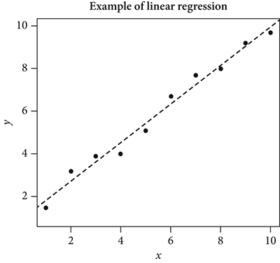
Figure 7.4 Plot of line of best fit: regression
With this concept established, the practical question becomes, how to figure the line? Aha: the method of least squares! Fitting the line is accomplished by calculating two features of the line and then drawing it from these values. The two features are (1) its starting point, called the “intercept,” and (2) its “slope.” Both are important. For where to start (the intercept), it may seem logical to begin at the zero point on the y-axis, but rarely does the regression line begin at zero, because, for many variables, there are no cases of zero value. For instance, with height, weight, test anxiety, and almost any belief or opinion, zero is not a realistic value. Because the start of the regression line is not zero, we must employ some procedure to figure out where it should begin. Accordingly, we define the intercept as the expected mean value on the y-axis (vertical) when the x values (on the horizontal axis) are zero. That is to say, the intercept is the average amount of y (i.e., of whatever variable that is dependent) without any consideration of x (the independent variable).
For the line’s slope, we must calculate its gradient. Here is where x enters our consideration. For its meaning, the slope is interpreted to be the degree of influence of the independent variable on the dependent one. Generally, a steep slope shows significant influence, a low slope means less influence, and a flat slope indicates no correlational relationship at all.
Mathematically, positioning the regression line in the data is accomplished by minimizing the sum of squared values for each data point to the mean of all the data. It is called the “least squares solution.” Because of this, regression for linear variables is technically referred to as “ordinary least squares,” or often just OLS.
Again, imagine the data plot just mentioned with the data points arrayed and a straight line drawn through them. For each data point, envision a short, vertical line between it and the main regression line. For data points above the regression line, their individual short lines will extend vertically downward to the regression line, and, correspondingly, data points below the regression line will have a short vertical line extending upward. This is shown in Figure 7.5.
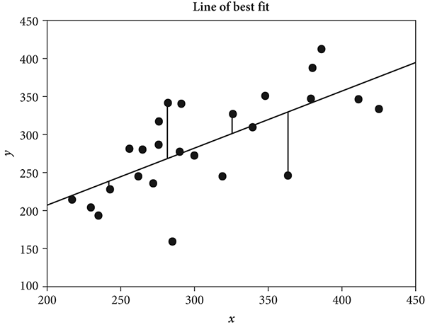
Figure 7.5 Plot of line of best fit, showing some of the drop lines
Next, imagine further that each short, vertical line, regardless of whether it extends upward or downward to the regression line, is one side of a perfect square. Theoretically, then, a perfect square is drawn for each data point. If there are, say, eighty-five data points, the image of the plot will show eighty-five perfect squares. Some of them are above the regression line, and others are below it, but each square will have one of its corners touching the regression line. Knowing the area for each square is useful to our progress because the smaller the area, the closer the initial data point will be to the regression line. By simple math, the area of a square is calculated by cross multiplying its two dimensions, length and height. For instance, if a square has a length of 2 and a height of 2, its area is 4 (2 × 2 = 4).
In theory, in the method of least squares, the areas for all eighty-five (or however many) squares are summed to make a total squared area. This total squared area is important to figuring the line of best fit because, in regression, the line of best fit is established when the total squared area is at its minimum. Figure 7.6 is a plot of the regression showing least squares.
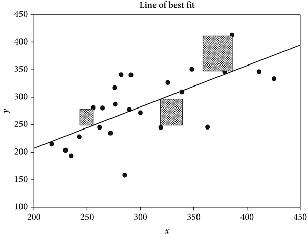
Figure 7.6 Plot of regression showing some of the squared distances
In the OLS scenario, when either of the two features for a regression line (i.e., its intercept and its slope) is changed, the total squared area will be different. Obviously, there are infinite possibilities for where a line may be placed over a set of data points, but willy-nilly placement is not sensible. The method of least squares finds the best-fitting line to the observed data. This feature lets us interpret the regression line as the best representation of the data set.
That is the whole point of the regression line: to represent an array of data, gathered by observation for x and y variables. Hence, the regression is a graphic representation of the relationship between two variables. (It can be extended to include more than two variables.)
Placement of the regression line to maximize its representation of the data is easiest to imagine—and to compute—when the variables are linearly related. But even when the variables are not linear, the method can be extended to find a second-degree curve fit, or it can be generalized to accommodate even more curves. Knowing this, we turn our attention to practical features for calculating the regression line itself.
Although this book is not technical, and as mentioned several times already, I deliberately eschew formulas in it, I am making an exception for the regression equation: Legendre’s or Gauss’s equation. Because this equation is so well known and the idea behind it is vital to our new quantifying perspective, it is worthwhile to examine it, however briefly. The regression equation culminates from the above explanation and is the mathematical expression of the method of least squares. It is as follows:
![]()
Simply, in the regression equation, the y is our outcome, or the value we want to produce for the dependent variable. In practice, this value is a prediction for the dependent variable, given consideration of the independent variable. The right side of the equation shows how we involve the independent variable in predicting the y. Specifically, the a is our starting point (the intercept) showing where we begin placement on the dependent variable scale, as discussed above. The x is the independent variable, and the b (called a “coefficient”—remember this from expanding the binomial) is the amount of influence that x has on producing a y outcome. (Those working with regressions call this the “percent of variance explained.”) This degree of influence comes from the initial correlation between the two variables. A strong correlational relationship signifies that the independent variable can be powerfully influential in predicting a given value in the dependent variable. A weak correlational relationship means it is less so.
As apparent in the equation, one must calculate the a and the b. (Realize that solving the regression equation is different from calculating its proof. As I mentioned earlier, detailing the proof requires the more sophisticated mathematics of calculus and linear algebra.)
Calculating the a and the b is not difficult. Regardless, I do not solve for them here, because that would distract us from our narrative. Our purpose is to understand the concept and see how it plays into the story of quantification. Regardless, solving the regression equation can be done by hand, or computer help is readily available on many websites. In Microsoft Excel, a macro can even be used to do the calculations. And, of course, all major statistical programs, such as SAS, SPSS, Minitab, Mathematica, and R, specialized statistical modeling programs such as Stata and Latent GOLD, and even some graphing programs like SigmaPlot can do the work in seconds. The very number and scope of these available programs illustrates how universal regression is, not only for the researchers who use these programs but also for any interested person in the broader population.
For researchers and mathematicians, there are three main uses for correlation and regression. First, in experiments, regression can be used to test hypotheses about cause-and-effect relationships. Here, the researcher explores changes in the dependent (y) variable that may be caused (at least in part) by changes in the independent variable (x). Recall that such changes may be naturally occurring (such as gender) or the result of external incidents or circumstances (such as in changing income levels), or they may be wholly contrived by the researcher (such as when an experiment requires participants to use less sugar in their diet for a week).
A second purpose for regression is to explore the correlational relationship between variables without necessarily inferring a cause-and-effect relationship. In this scenario, the variables are not identified as independent and dependent. The researcher does not manipulate one of them to examine changes in the other. Rather, naturally occurring ranges in both variables are contrasted, and the strength of association is studied. When changes are observed, the researcher infers some degree of influence of one variable on the other.
The third common use of regression is for mathematical estimation. A given value in the independent variable is set to determine the corresponding regressed value in the dependent. This is often useful for planning purposes.
From even this brief description of the method of least squares, one can appreciate its elegance as a problem-solving technique, and the profound influence it has had on the concept of quantification generally. It is both clever and sophisticated. From a math theory standpoint, it is relatively simple; with only a little study, its internal workings are easy to understand. Procedurally, the calculations are not difficult or involved. Even its calculus proof is undemanding to those with the requisite background. And, of particular importance, interpreting the results is straightforward and usually unambiguous.
Second, beyond the elegance of its use as a data-handling technique, the method of least squares exercises tangible influence over our lives, in both daily and extraordinary events. It brings prediction to a reliable, meaningful place. Just think how often it is that we predict something. Here, I do not mean predict as a researcher’s term, but as it is used in popular speech. How common it is for us to say words such as predict, guess, anticipate, foretell, forecast, envisage, and portend, and phrases such as “I know what will happen” and “I can see that. …” Certainly, you can add to this list. In popular speech, these words and phrases all indicate roughly the same thing: prediction about future events.
Regression brings to us the notion of prediction as a quantifiable thought and perspective. It is, quite simply, so broadly and profoundly influential in moving us to a quantification outlook on our world that its importance cannot be overemphasized. Thus, we have gone from observation to probability and on to prediction, through regression—quite an evolution of thought and processing of information. We will see regression throughout the rest of the story of quantification.